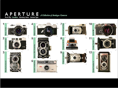
So after last classes critique, I got the most positive feedback from my analogue sketches that were superimposed over the photos of each camera. In this way, my rendering style reflects the analogue properties of the camera in my collection. The chosen layout however, comes from the digital icon layout. I had to adapt it to a full format since we are on a tight time frame to crank out these websites, and creating scrolling content and capabilities in flash for a website is pretty difficult. I've also turned the TLR cameras right side up, so that they are oriented as they actually would be when used. The first two sorting worked pretty well with the TLR's in the layout, however, the third has some issues since by camera type, three TLR's occur in a row, which can't be done vertically in a single column. So that still needs to be addressed. For now I simply pushed a fourth camera on each vertical column to make space for the first TLR in another column.

In each of the macro layouts, I have began using a negative image that focuses on details of that particular camera. The negative reflects the analogue film each camera uses, and helps to provide contrast for the type to be legible. For now, the info graphic on the right hand side is all I have in the layouts, so the info graphics will be shown some love next. The printers were also not working last night, so I couldn't print the cameras out to draw over them, so for now the other cameras are strictly photography. But refer to the Minolta Autocord, Kodak Instimatic, and Nikon TG-20 for the sketchy quality the others will have later. Each camera, when in the macro view, will have a smaller set of thumbnails below them, which when clicked will change the larger main photo. These photos will be without the sketchy rendering properties, so that the full camera and details are unobstructed.


No comments:
Post a Comment