This style uses a horizontal layout, using a spool of 120 film as a background element, and for scrolling purposes.

The next style shows each camera in the hands of a person, thus putting it's size in context. Perhaps clothing of the person could also play a part.

The final style is a vertical scrolling style making use of large image windows and side to side expanding windows.


Hi Brandon,
ReplyDeletesitemap:
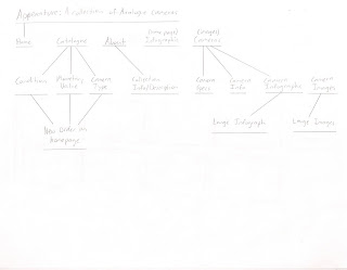
cameras should be sorted through your three methods. it looks like you have the catalogue and the cameras at the same level.
I'm a bit confused by your wireframes. In some instances, I can't tell which is the macro (where we have 3 sorting methods) and which one is the micro (the reveal of one camera) It's difficult to give feedback without annotations of your wireframes or more extensive notes, so I advise you to seek feedback from your studio-mates. I will say that you need to have the collection all visible at once, and the sorting will either rearrange the items or call attention to them in some way. I'm not seeing that in these wires.
Also, what is a "style sketch"? Make sure you are applying the vocabulary we are learning in IA.
Marty