So the critique went fairly well. I'm definitely happy with the end result of the weight weenie campaign, and look forward to using it as a portfolio piece. It's been a great insight into another design system that is applicable to society, and a great new exploration into the worlds of design research and the study and targeting of a particular subculture. I'll be sure to use the design research skills we've learned in future work.
On another note, there are a few things that can always be improved. The U-lock section of the campaign still needs work. The chain pattern isn't working well with the audience either, and I think I need to re-evaluated designing for the bike rack. I've considered designing something that wraps around the bar of the bike rack rather than existing on a u-lock that might be missed or torn off. And although it might have been out of my budget and time constraints, I would like to explore different materials for printing and design as well. Should I have designed the wrap that would attach to a bike rack's main bar, paper would have been flimsy and unpractical when it rains. Some sort of plastic or signage material would be interesting to look into, and might spark some research on my part into the world of industrial and package design.
The rest of the campaign however turned out great. I'm pleased with the patterns and the fact that it is guerilla advertising that penetrates and resounds within the subculture is fantastic. It's always a great thing to design something that will be kept as opposed to thrown away. The idea of collectibility is also something new to my work, and designing in a series certainly lends to that desire to trade and gather these different patterns and statements. The bandanas in particular were my favorite part of the project. I've never used textile products in my designs, so it was great to include that, and using them as a highly visual form of advertising, completely devoid of text was a great learning experience as well. Design that functions in that way is very interesting and powerful stuff, and lends to the underground and unknown secrets of a subculture.
Below is a scribd file of my presentation at critique, plus the font that wasn't on my presentation computer. I've certainly learned the importance of using fonts available across multiple systems.
Hey Weight Weenie Presentation

Showing posts with label Critique. Show all posts
Showing posts with label Critique. Show all posts
Wednesday, April 6, 2011

Wednesday, December 1, 2010
NA: Project 8 Critique Statement
In my interactive diagram, I have explored the use of a designer controlled structure, employing occasional interactive elements. Most of the interactive elements grow/ enlarge when hovered over, peaking interest and prompting the user to click on them. By using flash, any information that could not be fit into the bubbles in my print versions could be contained, better relating to the shapes, and creating less clutter. While my schematic does not employ code, uses rollover and movie clips to keep the user interested, and to keep the animations moving quickly. Moveable buttons also keep the user going so they don't become too bogged down with any one particular button. Color transitions have also cut my schematic in half. In the printed version, feedback section had to be another linear segment, much like the first blue to orange length. However, since in a digital medium color transition is simple, the same could be accomplished in a single length by changing the colors, and heading the opposite direction.


Wednesday, November 10, 2010
NA: Information Project Response/ What I learned.
In my information project for Narrative, I set out to create an instructional video to operate a Holga 120 CFN. We've done demo's and went roughly over creating and moving text in space in after effects. However, after the past lomo projects, I've been using analog methods and combining them with digital methods to create interesting effects. So with this project I decided to shoot my text as print with a video camera, and then bring that in on top of my recorded video.
In the process of filming Casey (My subject for handling the Holga), stability was a major issue. Walking with a camera creates a lot of shaking, so I set out to learn to make a poor mans steady cam. Essentially I filled 3 water bottles and attached them to the legs of my tripod. This greatly reduced the shaking when lifting it with the camera on top.
Shooting the text on paper creates a lot of shadows. Other than levels, I learned to use white clean surfaces (paper in this case) behind my white subject matter. With less shadows in the recording, there were far less shadows flying around the screen. I particularly enjoyed the areas where the cameras focus blurred the type. If I had created the text in after effects, it all would have felt too perfect and clean.
In the process of overlaying the text and video, I had to cut the video. I learned that shooting from multiple sides of a subject can create for interesting jump cut transitions, and can help cut down time that would have taken for the camera to move or pan around the object. The text movement was a learning experience as well. Rather than trying to line its movement up perfectly with Casey's movement in the video, I learned that letting the movements be drastically different helped to create contrast. This was essential after choosing to pause the video in the places where text entered the project. In this way, the type wouldn't distract from the video, and the text could be easily taken in and legible. The relationship in the narrative in terms of timing was a difficult process as well. I didn't want it to feel to start and stop, so in several cases, I learned to combine several type segments together, eliminating a few stops and letting the video continue for a while. That jumpiness also got in the way of some of the cut transitions in the audio editing.
The text acts as the instruction in the video, and the video sort of confirms the text or the action the text was trying to convey. I thought this relationship was more interesting than having them run simultaneously and stopping the video also creates a reference to photography.
Throughout the project, I was greatly limited by the recourses. It occurred to me too late into the project that I should have started finding a lomo to use at least a week earlier. I could have shot and had more time for editing had I done that. I was also bonded to the Media centers schedule in using the hd sony handicam. Having more time in the check out would be nice.
In the integration process, I've learned basic green screen idiology, though I did it with black and white. It was an interesting experiment in using the switches/ modes in after effects to knock out flat planes of color. I am frustrated that I couldn't figure out how to make my type white rather than black after applying those effects. I hope to figure out what went wrong in future projects. Perhaps it was just an error on after effects part.
Throughout the narrative, the contrast between video and text times was a key part in the informative process. Keeping the 2 channels separate but still integrated was a great learning experience in creating multilevel narrative.
In the process of filming Casey (My subject for handling the Holga), stability was a major issue. Walking with a camera creates a lot of shaking, so I set out to learn to make a poor mans steady cam. Essentially I filled 3 water bottles and attached them to the legs of my tripod. This greatly reduced the shaking when lifting it with the camera on top.
Shooting the text on paper creates a lot of shadows. Other than levels, I learned to use white clean surfaces (paper in this case) behind my white subject matter. With less shadows in the recording, there were far less shadows flying around the screen. I particularly enjoyed the areas where the cameras focus blurred the type. If I had created the text in after effects, it all would have felt too perfect and clean.
In the process of overlaying the text and video, I had to cut the video. I learned that shooting from multiple sides of a subject can create for interesting jump cut transitions, and can help cut down time that would have taken for the camera to move or pan around the object. The text movement was a learning experience as well. Rather than trying to line its movement up perfectly with Casey's movement in the video, I learned that letting the movements be drastically different helped to create contrast. This was essential after choosing to pause the video in the places where text entered the project. In this way, the type wouldn't distract from the video, and the text could be easily taken in and legible. The relationship in the narrative in terms of timing was a difficult process as well. I didn't want it to feel to start and stop, so in several cases, I learned to combine several type segments together, eliminating a few stops and letting the video continue for a while. That jumpiness also got in the way of some of the cut transitions in the audio editing.
The text acts as the instruction in the video, and the video sort of confirms the text or the action the text was trying to convey. I thought this relationship was more interesting than having them run simultaneously and stopping the video also creates a reference to photography.
Throughout the project, I was greatly limited by the recourses. It occurred to me too late into the project that I should have started finding a lomo to use at least a week earlier. I could have shot and had more time for editing had I done that. I was also bonded to the Media centers schedule in using the hd sony handicam. Having more time in the check out would be nice.
In the integration process, I've learned basic green screen idiology, though I did it with black and white. It was an interesting experiment in using the switches/ modes in after effects to knock out flat planes of color. I am frustrated that I couldn't figure out how to make my type white rather than black after applying those effects. I hope to figure out what went wrong in future projects. Perhaps it was just an error on after effects part.
Throughout the narrative, the contrast between video and text times was a key part in the informative process. Keeping the 2 channels separate but still integrated was a great learning experience in creating multilevel narrative.
Thursday, October 28, 2010
Visual Language: SoyJoy Process Post
So the final critique for the modes of appeal project starts tomorrow. This post will show some of my process throughout the project and explain some of my concepts and reasonings.
To start out the project, we learned about the 3 modes of appeal, and how to use those effectively to persuade an audience. The project was to redesign a products packaging using the 2 modes of appeal that it isn't currently using, and to make it look better of course.
For my packages, I chose Mrs. Meyers basil liquid hand soap, SoyJoy fruit and nutrient bars, and Nescafe instant coffee. The 3 backages were different materials and had considerably different forms. Mrs. Meyers was using Ethos, SoyJoy was using Logos, and Nescafe was using Pathos.

After passing our package choices by Jamie, we started doing thumbnail sketches for each product, attempting to create concepts for the 2 modes of appeal that each product was not utilizing.


My best sketches seemed to be SoyJoy's. I think I might have been biased toward SoyJoy from the beginning, but the relation between fruit and the human body was an interesting concept. After deciding on which package we wanted (SoyJoy), then we began a round of digital iterations. I also couldn't find an online eps of SoyJoy's logo, so I had to vectorize it myself.

The Berry direction worked best for Pathos. The bright colorful and fresh fruit helps to pull at the consumers hunger and healthy habits, while the words represent the benefit of each berry eaten. For Ethos, I liked the direction using a SoyJoy bar in place of a fitness aid. This created an interesting dialogue between the importance of SoyJoy's nutrients, and the activities of reliable and consistent athletes. They create a sense of trust in the consumer that SoyJoy is a necessity to their diet/ work out routine.
The Berry direction however was too crowded, and very illegible. The full bleed imagery also didn't work well with SoyJoy's persona. The bike direction also didn't hit it off to well with my peers, and while working, the idea of being 100% U.S. grown popped into my head.

With our concepts firmly in hand, we began to fully design them, and mock them up in real size. The photographic images in both directions switched into vector artwork, using flat plains of color and representing the simplicity of ingredients that SoyJoy uses in their ad campaigns. I created my first box, designing around the sides for my Ethos direction, and I created many iterations for the placement of text and image for my Pathos direction.

The colors needed to be worked out for the Ethos direction. The soil was too dark, and the sky wasn't quite blue enough.

The side was also begging for a mission statement. I digitalized the nutrients table so that it would be clear, and because I thought it was a necessary experience. Overall, the design for the box went well, and I moved on to the final box. As for the Pathos direction, I chose a pale yellow, with luscious reds and magentas for the berries. Things popped, and I moved on to designing the final box for it as well, using the same template as the Ethos box. The berries were arranged in a sort of balancing act, reflecting the life of the consumer.


To start out the project, we learned about the 3 modes of appeal, and how to use those effectively to persuade an audience. The project was to redesign a products packaging using the 2 modes of appeal that it isn't currently using, and to make it look better of course.
For my packages, I chose Mrs. Meyers basil liquid hand soap, SoyJoy fruit and nutrient bars, and Nescafe instant coffee. The 3 backages were different materials and had considerably different forms. Mrs. Meyers was using Ethos, SoyJoy was using Logos, and Nescafe was using Pathos.

After passing our package choices by Jamie, we started doing thumbnail sketches for each product, attempting to create concepts for the 2 modes of appeal that each product was not utilizing.


My best sketches seemed to be SoyJoy's. I think I might have been biased toward SoyJoy from the beginning, but the relation between fruit and the human body was an interesting concept. After deciding on which package we wanted (SoyJoy), then we began a round of digital iterations. I also couldn't find an online eps of SoyJoy's logo, so I had to vectorize it myself.

The Berry direction worked best for Pathos. The bright colorful and fresh fruit helps to pull at the consumers hunger and healthy habits, while the words represent the benefit of each berry eaten. For Ethos, I liked the direction using a SoyJoy bar in place of a fitness aid. This created an interesting dialogue between the importance of SoyJoy's nutrients, and the activities of reliable and consistent athletes. They create a sense of trust in the consumer that SoyJoy is a necessity to their diet/ work out routine.
The Berry direction however was too crowded, and very illegible. The full bleed imagery also didn't work well with SoyJoy's persona. The bike direction also didn't hit it off to well with my peers, and while working, the idea of being 100% U.S. grown popped into my head.

With our concepts firmly in hand, we began to fully design them, and mock them up in real size. The photographic images in both directions switched into vector artwork, using flat plains of color and representing the simplicity of ingredients that SoyJoy uses in their ad campaigns. I created my first box, designing around the sides for my Ethos direction, and I created many iterations for the placement of text and image for my Pathos direction.

The colors needed to be worked out for the Ethos direction. The soil was too dark, and the sky wasn't quite blue enough.

The side was also begging for a mission statement. I digitalized the nutrients table so that it would be clear, and because I thought it was a necessary experience. Overall, the design for the box went well, and I moved on to the final box. As for the Pathos direction, I chose a pale yellow, with luscious reds and magentas for the berries. Things popped, and I moved on to designing the final box for it as well, using the same template as the Ethos box. The berries were arranged in a sort of balancing act, reflecting the life of the consumer.


Sunday, October 10, 2010
Visual Language: Class Critique and Concept Directions
So, returning to SoyJoy. After my meeting with Raynoldo during our mini critique last friday, I've narrowed down to the 6 best directions to go to. (At least from the ones I've already created. Some new ones might reveal themselves as I work.) These 6 are obviously divided as 3 concepts for each of the two modes I'll be using, which were Pathos and Ethos. The bullet points following each concept are the ways Ray and I thought would work well graphically.
Pathos:
Photography or Illustration will appeal to the consumers emotions rather than vector lines and shapes. Perhaps even a combination of the two. Maybe the SoyJoy bar and the rest of the image are different rendering methods?)
1. The human figure, male or female, placed in a dramatic scene, but armed with a SoyJoy bar in their pocket, hand, somewhere on their person. (If rendered analog, charcoal might be nice, or some other rough tool. The lighting should be dramatic in terms of the dangerous aspect, but the Person with the SoyJoy bar should be even and calm.)
2. SoyBeans or fruit in place of an important body part or organ. (The human body will be photographic to help relate to the consumer, but the Soybeans/ Fruit might be rendered with something simple. Pen and ink, colored pencil, and Watercolor all sound interesting. I might even try drawing with the fruit or soybeans themselves and see what I can do with them.)
3. Using the fruit in SoyJoy to represent certain things we all want; Happiness, Strength, Stability, Relaxation, Health, Simplicity, etc. (Photography or a medium with intense colors.)
Ethos:
For the SoyJoy brand, I think that an all photographic approach would establish more credibility with the consumer, and really get the point across of SoyJoy brand bars being a health supplement and betterment to someone's life, fit or not.
1. The SoyJoy bar finds itself in place of some fitness tool or aid.
2. SoyJoy bar partially buried in farm soil. (Grown on U.S. soil.)
Pathos:
Photography or Illustration will appeal to the consumers emotions rather than vector lines and shapes. Perhaps even a combination of the two. Maybe the SoyJoy bar and the rest of the image are different rendering methods?)
1. The human figure, male or female, placed in a dramatic scene, but armed with a SoyJoy bar in their pocket, hand, somewhere on their person. (If rendered analog, charcoal might be nice, or some other rough tool. The lighting should be dramatic in terms of the dangerous aspect, but the Person with the SoyJoy bar should be even and calm.)
- Man standing before a destroyed city.
- Woman Staring down a tidal wave or storm.
- Kid staring down bullies.
- Kid on a bike looking at a huge hill.
- Cowboy with SoyJoy in place of gun.
- Boxer staring down another boxer.
2. SoyBeans or fruit in place of an important body part or organ. (The human body will be photographic to help relate to the consumer, but the Soybeans/ Fruit might be rendered with something simple. Pen and ink, colored pencil, and Watercolor all sound interesting. I might even try drawing with the fruit or soybeans themselves and see what I can do with them.)
- SoyBeans as 2 halves of the brain. (Think Healthy)
- SoyBeans as Lungs
- Berries as Heart
- SoyBeans as muscles
3. Using the fruit in SoyJoy to represent certain things we all want; Happiness, Strength, Stability, Relaxation, Health, Simplicity, etc. (Photography or a medium with intense colors.)
Ethos:
For the SoyJoy brand, I think that an all photographic approach would establish more credibility with the consumer, and really get the point across of SoyJoy brand bars being a health supplement and betterment to someone's life, fit or not.
1. The SoyJoy bar finds itself in place of some fitness tool or aid.
- In place of Ipod for runner.
- In place of water battle holder on bicycle.
- SoyBean in place of Yoga ball
- In place of weights.
- In place of punching bag.
- In place of jumprope handles.
2. SoyJoy bar partially buried in farm soil. (Grown on U.S. soil.)
Friday, May 7, 2010
VisCom2: Sophemore Review Proposal
So to start my sophomore review, I think I'll start in the earlier projects of the first semester and sort of bleed over into the new ones as I go. The project order is as follows:
I'll start by discussing the Line Book. It showed relations between both graphic vector forms and formal photography. The exercises in that project really took over, and we got quite experimental with different media, hands on processes, and even photography of the vector lines in the environment via projection. This also let me experience projection through lenses and the warping it causes.


The line book was also our first accordion book. This helped me visualize the book as a whole since it could all unfold and be seen as a long section rather than individual pages. This forced me to make formal relationships in the page order process, and made me consider the narrative of my travels when taking the photography.
From there I want to move on to the Hafnium Project. In this project I started to learn about type and how to place it all within a horizontal magazine composition, and then later, a vertical web page format. We had to create a memorable logotype that communicates well and holds up to different size applications. We also practiced hierarchy with scale, typeface choices, kerning between letters, leading between lines, and working with the rags and alignment of type. We also had to create an aesthetically pleasing composition utilizing this type with imagery dealing with our elements.


This followed through to the Everest Magazine project. All the spacing and hierarchy lessons carried over from the Logotype project, but this time, we had to work specifically for the magazine. The layout had to be better designed, and had several pages rather than 2. I learned how to use seperate articles in the same layout and had to create ways to differentiate them in a sort of system. Using full bleed imagery to create a documentary sort of feel, also created legibility issues I had to work with. The info graphics also had to be designed around, and accommodated for in our layout space, as well as adapted to fit the other design choices and type choices we made in the layouts.


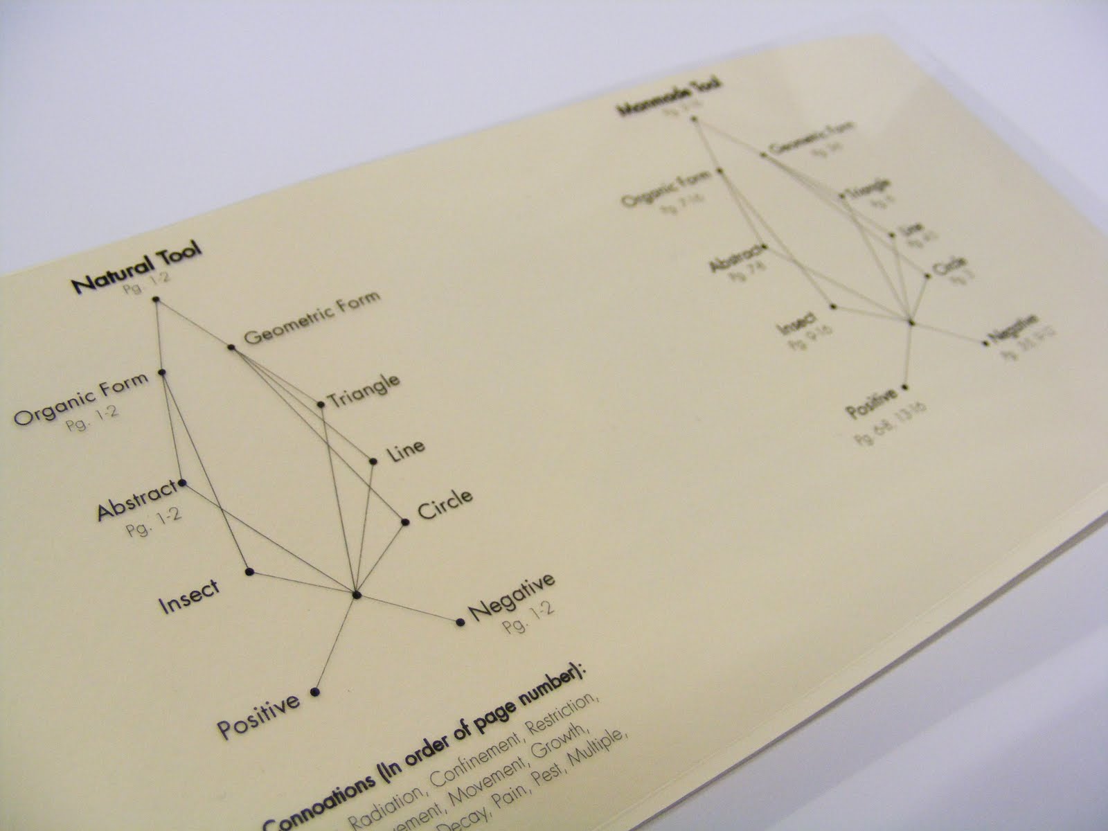
The taxonomy book project reverted back to the multimedia experience of the line book. We began with an analog method of mark making, using various tools and ink on paper. Our tools reflected the mark we were attempting to make, that would add further meaning to our haiku's. After creating those marks, we adapted them to a classification system and bound that in a book in whatever format we chose. I used an information graphic style table of contents for my book and used a theme of transparencies to see the marks together. A longer page was made to see each page individually as well. Working with transparencies required me to learn how to overlap pages without overlapping type and compromising legibility for looks.


The 3d letter form project required a different view of perspective on typography in space. The previous projects placed text on a 2 dimensional plane, so we were challenged to bring a letter form into a real space, through precision crafted sculpture. I chose the Kabel capital W, and wanted to create a vanishing point on one side of the 3. I wanted to use the letters architectural and art deco feel to be complimented by it's 3 dimensional aspects. We also photographed and vectored images of our letter forms, allowing use to apply different color schemes to the planes our letters created.


The color followed into the 7 Sins in Light project. This book challenged me to represent the seven deadly sins, and I challenged myself further by doing it with colored light and long exposures of a camera. I had to learn the corresponding colors to each sin, and create compositions that would also reflect them. This all had to be done within a 10 second exposure in a pitch black room. I also referenced the colors in the books table of contents and cover as another system similar to the taxonomy projects table of contents.


The 6 degrees project was also strongly rooted in photography. Rather than representing the sins, we had to advertise for the National Geographic Movie "6 Degrees Could Change the World". We had to create an informational design that could cross various formats (DVD, poster, DVD menu), and still look cohesive. We used a blue sky and industrial imagery in the background to root our topic in CO2 emissions, and to help give us enough space for text. This was especially important in our poster where we used green tips as an informational element when the viewer would get closer to the poster. In this way, we also worked with layers of viewing, and how size of typography helps to create that hierarchy. We used the CO2 Molecule as a consistent element through our system to hold both type and image.
The Designer Poster for type was a great hierarchy experience. We had to use elements of another designers style and create a full sized poster for a hypethetical lecture at our Epperson Auditorium. Using type at huge scales, and working with the layers of viewing that we used in the 6 degree project became our challenge. Bradbury Thompson used many moving images and overlapping fields of color to convey an Idea. I had to drop many first ideas, eventually shooting people moving throughout the audience seating area of the lecture hall. To create visual depth, I placed type behind sections of the background to obscure them and create visual interest. My color palette was both masculine and modern.

The Icon Merchandising System Book became our first taste of branding, and mocking up various forms of advertising. We had to work under a pre-designed logo for the Smithsonian, and apply that to a design system all our own. I decided to push the winter theme of my icons and used fitting merchandise like Carabiners, Winter hats and scarves, and stamps to use while traveling. My concept behind my Smithsonian was a mix of Pattern and masked imagery inside my logos to create instances of Relay. For example, my tent shows imagery of a turtle shell, meaning it's portable and is a form of protection and home. The Ice axe pattern forms a ladder, meaning ascension. And the crampon boot icon creates a tire tread pattern, emphasizing it's purpose of traction on icy surfaces. The type lock up that I used for the exhibition series creates a mountain, visually leading your eye over a peak.


- Line Book
- Hafnium Project
- Everest Magazine
- Taxonomy Project
- 3d Letter Form
- 7 Sins in Light
- 6 Degrees
- Bradbury Thompson Poster
- Icon System Book
I'll start by discussing the Line Book. It showed relations between both graphic vector forms and formal photography. The exercises in that project really took over, and we got quite experimental with different media, hands on processes, and even photography of the vector lines in the environment via projection. This also let me experience projection through lenses and the warping it causes.


The line book was also our first accordion book. This helped me visualize the book as a whole since it could all unfold and be seen as a long section rather than individual pages. This forced me to make formal relationships in the page order process, and made me consider the narrative of my travels when taking the photography.
From there I want to move on to the Hafnium Project. In this project I started to learn about type and how to place it all within a horizontal magazine composition, and then later, a vertical web page format. We had to create a memorable logotype that communicates well and holds up to different size applications. We also practiced hierarchy with scale, typeface choices, kerning between letters, leading between lines, and working with the rags and alignment of type. We also had to create an aesthetically pleasing composition utilizing this type with imagery dealing with our elements.


This followed through to the Everest Magazine project. All the spacing and hierarchy lessons carried over from the Logotype project, but this time, we had to work specifically for the magazine. The layout had to be better designed, and had several pages rather than 2. I learned how to use seperate articles in the same layout and had to create ways to differentiate them in a sort of system. Using full bleed imagery to create a documentary sort of feel, also created legibility issues I had to work with. The info graphics also had to be designed around, and accommodated for in our layout space, as well as adapted to fit the other design choices and type choices we made in the layouts.


The taxonomy book project reverted back to the multimedia experience of the line book. We began with an analog method of mark making, using various tools and ink on paper. Our tools reflected the mark we were attempting to make, that would add further meaning to our haiku's. After creating those marks, we adapted them to a classification system and bound that in a book in whatever format we chose. I used an information graphic style table of contents for my book and used a theme of transparencies to see the marks together. A longer page was made to see each page individually as well. Working with transparencies required me to learn how to overlap pages without overlapping type and compromising legibility for looks.




The 3d letter form project required a different view of perspective on typography in space. The previous projects placed text on a 2 dimensional plane, so we were challenged to bring a letter form into a real space, through precision crafted sculpture. I chose the Kabel capital W, and wanted to create a vanishing point on one side of the 3. I wanted to use the letters architectural and art deco feel to be complimented by it's 3 dimensional aspects. We also photographed and vectored images of our letter forms, allowing use to apply different color schemes to the planes our letters created.


The color followed into the 7 Sins in Light project. This book challenged me to represent the seven deadly sins, and I challenged myself further by doing it with colored light and long exposures of a camera. I had to learn the corresponding colors to each sin, and create compositions that would also reflect them. This all had to be done within a 10 second exposure in a pitch black room. I also referenced the colors in the books table of contents and cover as another system similar to the taxonomy projects table of contents.


The 6 degrees project was also strongly rooted in photography. Rather than representing the sins, we had to advertise for the National Geographic Movie "6 Degrees Could Change the World". We had to create an informational design that could cross various formats (DVD, poster, DVD menu), and still look cohesive. We used a blue sky and industrial imagery in the background to root our topic in CO2 emissions, and to help give us enough space for text. This was especially important in our poster where we used green tips as an informational element when the viewer would get closer to the poster. In this way, we also worked with layers of viewing, and how size of typography helps to create that hierarchy. We used the CO2 Molecule as a consistent element through our system to hold both type and image.
The Designer Poster for type was a great hierarchy experience. We had to use elements of another designers style and create a full sized poster for a hypethetical lecture at our Epperson Auditorium. Using type at huge scales, and working with the layers of viewing that we used in the 6 degree project became our challenge. Bradbury Thompson used many moving images and overlapping fields of color to convey an Idea. I had to drop many first ideas, eventually shooting people moving throughout the audience seating area of the lecture hall. To create visual depth, I placed type behind sections of the background to obscure them and create visual interest. My color palette was both masculine and modern.

The Icon Merchandising System Book became our first taste of branding, and mocking up various forms of advertising. We had to work under a pre-designed logo for the Smithsonian, and apply that to a design system all our own. I decided to push the winter theme of my icons and used fitting merchandise like Carabiners, Winter hats and scarves, and stamps to use while traveling. My concept behind my Smithsonian was a mix of Pattern and masked imagery inside my logos to create instances of Relay. For example, my tent shows imagery of a turtle shell, meaning it's portable and is a form of protection and home. The Ice axe pattern forms a ladder, meaning ascension. And the crampon boot icon creates a tire tread pattern, emphasizing it's purpose of traction on icy surfaces. The type lock up that I used for the exhibition series creates a mountain, visually leading your eye over a peak.


Monday, April 12, 2010
Image Making: Book Project, Crit Post
So for the Book project, I started out selecting my 4 books. I wanted to really cover as best I could, the 4 main aspects of a climb up Everest. This would be climbing skill, mountaineering skills, maps and guides, and of course the psychological preparation for the climb.
Here are the final 4 I went with:
Everest: A Trekker's Guide by Kev Reynolds
Ice and Mixed Climbing: Modern Technique by Will Gadd
Into Thin Air by Jon Krakauer
The Mountaineering Handbook by Craig Connally
It hen started with a series of sketches on different ideas for the covers. I knew I wanted to base my designs around a banner.


The first set seemed to be the most thought out, so I continued with those and layered the icons in a more interesting way to come up with the final book designs. I decided to selectively fill certain areas of the icons in the background, and leave the other sections black. If it was all filled, their would be too much going on, and make it difficult to read text. For the banner, I decided to use routes up Everest instead of simple rectangle forms. The inside flaps have the name of the route shown on the cover, as well as a little info on it. I decided to stagger the banded sections on the spine to keep the author name and book title from overlapping any images. This way they are more legible. The drop shadows were put in under each layer to just give it a little more dimensionality.
So here is the final set for the "Ascending Everest" series:


This project was provided a challenge with the cohesive series, and the individuality of each book. Creating things that have similar elements and seem to belong to the same family, but at the same time, keeping them looking different enough to keep the viewers attention. The content in the imagery was also a major aspect of this project. I had to create a visual narrative by putting different imagery next to each other. In "Everest: A Trekker's Guide", I used photo imagery of Everest next to maps and vector imagery to give a sense of direction and movement. I also paired the book with my crampon/ boot icon to convey the sense of planting a footprint in untraveled wilderness. In "Ice and Mixed Climbing: Modern Technique", I Paired a verticle ice wall and climber with a series of carabiners and climbing rope. I wanted a bit more of a technical hand book feel to this one since it's a how to manual sort of book. This was also the reason I wanted the series to be small, so that they could be easily stored into a backpack, and brought out into the field if needed. "Into Thin Air" brought on the narrative challenge, since it's a novel. I wanted to create a visual account of the story, so I layered imagery through overlays and different ice textures. I had to learn to mix these images and overcome the frames and edges they all presented. They had to look like one image, rather than a few collaged together. So a man with his arm separated symbolizes the main characters arm that is amputated after his Everest expedition. The banner has imagery Tibetan prayer flags, that are commonly found at the base of Mountains in the Himalayas, including Everest. Finally, "The Mountaineering Handbook" is similar to the Ice and Mixed Climbing book, in that it's also a manual. So decided to show a boot print to symbolize that step out into unknown territory again in the icon. The banner shows A man standing at the summit of Everest in his moment of triumph.
Creating mock up books was a great experience. Being able to bring out work into a physical, hand held experience for our viewer is a must as designers. I'm sure they'll also appeal to any viewers in future internships as well. If I were to redo this project, I would definitely spend more time on the craft of my mock up books. The spines are slightly too large due to miscalculation in the folding of the cover's joints, so the coveres don't fit as well as they should have. My inside foam core pages are also a little small.
Here are the final 4 I went with:
Everest: A Trekker's Guide by Kev Reynolds
Ice and Mixed Climbing: Modern Technique by Will Gadd
Into Thin Air by Jon Krakauer
The Mountaineering Handbook by Craig Connally
It hen started with a series of sketches on different ideas for the covers. I knew I wanted to base my designs around a banner.


The first set seemed to be the most thought out, so I continued with those and layered the icons in a more interesting way to come up with the final book designs. I decided to selectively fill certain areas of the icons in the background, and leave the other sections black. If it was all filled, their would be too much going on, and make it difficult to read text. For the banner, I decided to use routes up Everest instead of simple rectangle forms. The inside flaps have the name of the route shown on the cover, as well as a little info on it. I decided to stagger the banded sections on the spine to keep the author name and book title from overlapping any images. This way they are more legible. The drop shadows were put in under each layer to just give it a little more dimensionality.
So here is the final set for the "Ascending Everest" series:


This project was provided a challenge with the cohesive series, and the individuality of each book. Creating things that have similar elements and seem to belong to the same family, but at the same time, keeping them looking different enough to keep the viewers attention. The content in the imagery was also a major aspect of this project. I had to create a visual narrative by putting different imagery next to each other. In "Everest: A Trekker's Guide", I used photo imagery of Everest next to maps and vector imagery to give a sense of direction and movement. I also paired the book with my crampon/ boot icon to convey the sense of planting a footprint in untraveled wilderness. In "Ice and Mixed Climbing: Modern Technique", I Paired a verticle ice wall and climber with a series of carabiners and climbing rope. I wanted a bit more of a technical hand book feel to this one since it's a how to manual sort of book. This was also the reason I wanted the series to be small, so that they could be easily stored into a backpack, and brought out into the field if needed. "Into Thin Air" brought on the narrative challenge, since it's a novel. I wanted to create a visual account of the story, so I layered imagery through overlays and different ice textures. I had to learn to mix these images and overcome the frames and edges they all presented. They had to look like one image, rather than a few collaged together. So a man with his arm separated symbolizes the main characters arm that is amputated after his Everest expedition. The banner has imagery Tibetan prayer flags, that are commonly found at the base of Mountains in the Himalayas, including Everest. Finally, "The Mountaineering Handbook" is similar to the Ice and Mixed Climbing book, in that it's also a manual. So decided to show a boot print to symbolize that step out into unknown territory again in the icon. The banner shows A man standing at the summit of Everest in his moment of triumph.
Creating mock up books was a great experience. Being able to bring out work into a physical, hand held experience for our viewer is a must as designers. I'm sure they'll also appeal to any viewers in future internships as well. If I were to redo this project, I would definitely spend more time on the craft of my mock up books. The spines are slightly too large due to miscalculation in the folding of the cover's joints, so the coveres don't fit as well as they should have. My inside foam core pages are also a little small.
Subscribe to:
Posts (Atom)