In Visual Communication From Theory to Practice, they first cover the Shannon and Weaver communication model. At the time, it was created in relation to telecommunications, but was found to be applicable to all forms of communication.
Their model was extremely simple, with a spot for Source, Transmitter, Noise, Receiver, and Destination. There was no section for feedback, which they continue to describe as a necessity in design and advertising. The presence of a beta testing stage allows for a test run, a period to iron out the wrinkles in the project. It also is a great way to gauge public reactions, and to take estimates on statistics like sales figures and the effectiveness of the message being conveyed. It's much like public speaking. When giving a lecture, it helps to see nods or other bodily gestures as feedback to know that the audience is understanding the message. If there is no feedback, you can't know that your message is getting lost, or going over someone's head.
The noise was also an interesting section. Listening to a professor talk while they make far to many hand gestures is difficult. The extra fluff or stuff that gets lost creates a barrier that the viewer or listener must deal with. They mention the arts and crafts movement and the movement away from redundancy. This moved into modernism and the push for minimalism. Function over aesthetic. However, in transmission, and the sending of information, redundancy helps to cement an idea or get it across faster. This I agree with to an extent. There is certainly an extent to where repetition of an element is too much. Repetition generally causes a design to lose it's initial sparkle.
Receiver: Communication skills, knowledge, social system, culture, attitudes
Sender and Receiver both share the same qualities because they are essentially the same, especially when feedback becomes part of the scenario. We are all sending and receiving data constantly. The schematic still focuses on the relationship between a 1 on 1 sending receiving situation rather than a mass of people.
In the section under Sender, which also applies to receiver, Particularly thought the section on communication skills was the most important. The other 4 seemed new to me though, and they were interesting reads. The knowledge of the content that is being sent or received is completely imperative. If I were to receive an essay written by a scholar on a subject I wasn't familiar with, the terminology and level of writing would soar over my head, creating noise and distance between me and the message. The same can be said for social systems. With each generation comes a new barrage of slang terms. These words become noise between that generation and other generations without understanding of these terms. The writing style also fits in here. If I were to read The Divine Comedy, the writing style and wording particular to that time period are going to become a barrier between me and the content I'm interested in. Attitudes also become a big deal. If the receiver has no interest in the message being sent to him, such as spam mail in our inboxes, then the end result will be far from what the sender originally intended for that person to receive. The most interesting point however was his mentioning of touch used in social communication between the British and the French. Touch in that situation becomes an additional level beyond spoken word and even body language. With multiple channels conveying information, the message can be both more concrete and easily understood, or distorted by misunderstanding of the channel and it's intentions behind it.
The Message section explained the importance of encoding. In the encoding process, the sender must consider which code will be used, how it will be encoded (in order), and with what means. If using images, icons, symbols, or anything based in a worldwide acceptance of meaning, the sender has to consider with what extra information and contexts that message will bring to different cultures. Hierarchy also plays a major role. The elements that become placed in front of the others by aesthetic techniques or subject matter are going to come across to the viewer in the same way, assuming that the receiver has the same level of interest in the elements.
The Channel is a very broad section. The fact alone that he classified channel in terms of our senses limits this down exponentially. I loved that. Rather than rooting channel in what is currently available to us, such as television, computers, verbal language, writing and books, music, etc., the senses keep this nearly limitless amount of possibilities as a simple and timeless experience. Rather than you experiencing the message through email or what's on your screen, you receive the message through sight of the information on the screen, which is being encoded to you through the eye.
So, starting off the next project, we have started studying communication, and the process of broadcasting information. This video on laughingsquid.com is a 1953 instructional film for IBM, explaining this process and the noise that interfeers with this transmision. http://laughingsquid.com/a-communications-primer-1953-by-ray-charles-eames/
In todays world communication is sent in infinite ways, be it by computer, music, television, by mouth, by body language, by icons and symbols, or even the signals your brain intercepts and decodes when interacting with any of these communications. This video did a great job of bringing this complex process into a simple diagrammatic experience.
Using this diagram, explains the information transfer process in a nutshell.
The Sender has information
The Sender encodes the information
The Sender transmits or sends the information
Various noise, be it audio, visual, physical, mental interfere and alter the information
The Receiver gets the information
The Information is decoded
The Receiver then attempts to understand the information
However, it leaves out a major aspect of the broadcasting process. The feedback. In a game of telephone, it's crucial that the beginning sender gets feedback, or return information from their receiver. This allows for mutual understanding unless the noise is so great that the feedback is also distorted. With feedback, a person can attempt to fix the noise, or the connection, and can correct any mistakes made in the encoding process that may have become noise itself.
The simplicity of this diagram also leaves out many aspects of our decoding and encoding process. All aspects of our lives such as politics, culture, social constructs, etc. effect how we send and receive information. In the film the narrator mentions if you speak chinese to him and he can't speak or understand chinese, then he can't understand the message. Well beyond that, there is a further level of understanding. Through the process of understanding the chinese, there is a barrier or translation that must be overcome. A word in one language might have other meanings or contextual information that comes with it that the receiver misses out on. If you watch a Japanese move that has English subtitles or has been swapped with English dialogue, there is information lost in that transition of Japanese culture and linguistics to the English dialect. This can be said of any communication of differing culture or mode of communication that hasn't reached a worldwide agreement of meaning.
I thought this article brought up some valid questions that I've considered myself a few times. While it's true that a company should always look at new personas or ways to present themselves to the public, there are certain elements of ethics that can sometimes become a safety for the consumer to attach to. When a company has a reputation and has existed for a long time, people become comfortable with their advertising and design elements, and see them as a form of reliability. Companies like Morton's salt that have been around for many years barely change their design, sticking to that sense of nastalgia. However, it's also true that new design can real in a new generation of consumers. While I might not agree with Pepsi's new logo, the generation after me might, and it is securing new generations of consumers that keeps a company going. So while I do believe that keeping old design elements, I find myself a Coca Cola fan. Using their series of products, they've managed to use old design elements for classic products, while using newer ones for new products.
As for the quick feedback that these companies are receiving in terms of their newer designs, I find myself confused as to why companies like Tropicana aren't getting public response on their new advertising and design before spending the money to produce it. I understand the need for surprise to grab an audiences attention and to gain press, but we shouldn't ignore the need for constant criticism from peers and public groups.
So the final critique for the modes of appeal project starts tomorrow. This post will show some of my process throughout the project and explain some of my concepts and reasonings.
To start out the project, we learned about the 3 modes of appeal, and how to use those effectively to persuade an audience. The project was to redesign a products packaging using the 2 modes of appeal that it isn't currently using, and to make it look better of course.
For my packages, I chose Mrs. Meyers basil liquid hand soap, SoyJoy fruit and nutrient bars, and Nescafe instant coffee. The 3 backages were different materials and had considerably different forms. Mrs. Meyers was using Ethos, SoyJoy was using Logos, and Nescafe was using Pathos.
After passing our package choices by Jamie, we started doing thumbnail sketches for each product, attempting to create concepts for the 2 modes of appeal that each product was not utilizing.
My best sketches seemed to be SoyJoy's. I think I might have been biased toward SoyJoy from the beginning, but the relation between fruit and the human body was an interesting concept. After deciding on which package we wanted (SoyJoy), then we began a round of digital iterations. I also couldn't find an online eps of SoyJoy's logo, so I had to vectorize it myself.
The Berry direction worked best for Pathos. The bright colorful and fresh fruit helps to pull at the consumers hunger and healthy habits, while the words represent the benefit of each berry eaten. For Ethos, I liked the direction using a SoyJoy bar in place of a fitness aid. This created an interesting dialogue between the importance of SoyJoy's nutrients, and the activities of reliable and consistent athletes. They create a sense of trust in the consumer that SoyJoy is a necessity to their diet/ work out routine.
The Berry direction however was too crowded, and very illegible. The full bleed imagery also didn't work well with SoyJoy's persona. The bike direction also didn't hit it off to well with my peers, and while working, the idea of being 100% U.S. grown popped into my head.
With our concepts firmly in hand, we began to fully design them, and mock them up in real size. The photographic images in both directions switched into vector artwork, using flat plains of color and representing the simplicity of ingredients that SoyJoy uses in their ad campaigns. I created my first box, designing around the sides for my Ethos direction, and I created many iterations for the placement of text and image for my Pathos direction.
The colors needed to be worked out for the Ethos direction. The soil was too dark, and the sky wasn't quite blue enough.
The side was also begging for a mission statement. I digitalized the nutrients table so that it would be clear, and because I thought it was a necessary experience. Overall, the design for the box went well, and I moved on to the final box. As for the Pathos direction, I chose a pale yellow, with luscious reds and magentas for the berries. Things popped, and I moved on to designing the final box for it as well, using the same template as the Ethos box. The berries were arranged in a sort of balancing act, reflecting the life of the consumer.
The McCoy lecture reviewed ways of creating and conception an idea, whether that be in writing ideas on post it notes, or working in an open collaborative space. It was very relative to all of our classes, but certainly visual language first and foremost. We were taught to create ideas in a quick and analog process, using paper, pencil, really whatever is around, and Mr. McCoy brought similar processes to light. Particularly those pertaining to prototyping, and creating simple "props" of our projects in order to simulate the experience, and perhaps better it for the final product. Cardboard and duck-tape were an excellent example, since you can cut and work with them anywhere in a quick and rough fashion.
He also talked to us about going out and experiencing the project yourself. Now this was geared toward his role as an industrial designer for sure, but it could be said of any part of design. In his example, he was reinventing the shovel, and in order to gain more footing on the product he was redesigning, and what could be bettered about it, he would ideally go out an dig a hole, using the shovel. I recently did a presentation over Tronic studios. In one of their video pieces, they were recreating the surrounding environment for a 57 story tower. In order to make the video experience seamless with reality, Tronic set out to the rooftops to laser tape measure the distances between all the buildings and other elements of the surrounding area around the tower. This is a level of dedication and craft that I will certainly try to create in my work process.
So I've chosen to design for the SoyJoy packaging. I'll be using Ethos and Pathos for my modes of appeal. I'm not certain as to my concepts yet, still sketching, but I'll upload some scans of my thumbnails later.
Some adjectives I've put together to sum up the SoyJoy experience:
Wholesome
Healthy
Simple
Moist
Fruity
Bold
Succulent
Complete
Tempting
Uncomplicated
Sumptuous
Baked
Fresh
Hearty
Lean
Organic
Whole
Luscious
Light
Natural
Hopefully using these adjectives will bring some ideas to the surface, or at least influence how I take any photos of fruit in the future. I personally like the idea of keeping the fruit to the minimal, but the fruit is a major selling point and attraction for the hungry consumer. So we'll just have to see.
In our visual language course, the class was tasked with creating a poster for a select Jazz artist performing at the down town Folly theater. We were first paired with another peer, my partner was Vi Pham, and we began gathering research on their musical career, style, instrument, other band members, etc. Vi and I were assigned Jazz vocalist Sachal Vasandani. It's been a great project, and I love his music. Nothing but possitive feedback.
To give you a bit of an idea to what we had to work with, here is a link to his music. Take a bit and enjoy.
So to start, we created a mood board. This essentially was a collection of imagery, colors, typography, just about anything to hint at the mood, style, pretty much what Sachal and his music "are".
Colors that seemed to fit reflected his calm, modern, and experimental style. The typography followed suit in the forms of modern san serifs. Sachal has always been a city dweller, and has a very sophisticated air about him, so modern architecture also found its way in. The placement of the imagery could have used a bit of work looking back on it. Probably something more organic and free.
After the mood board, Vi and I split ways. The project was essentially a competition. The Folly will only choose one of the posters from our entire class to advertise at the Folly, so we all set off to make our own posters. From here, we created matrixes that taught us the use of rhetorical tropes such as Hyperbole, Pun, Metaphor, Synecdoche, Parody, Irony, and much more.
Using these tropes, we sketched little ideas for design motions in our posters. Here were a few of mine:
After a very specific and difficult critique of our matrixes, we set off to make 15 sketches of 3 of the matrix ideas in poster format.
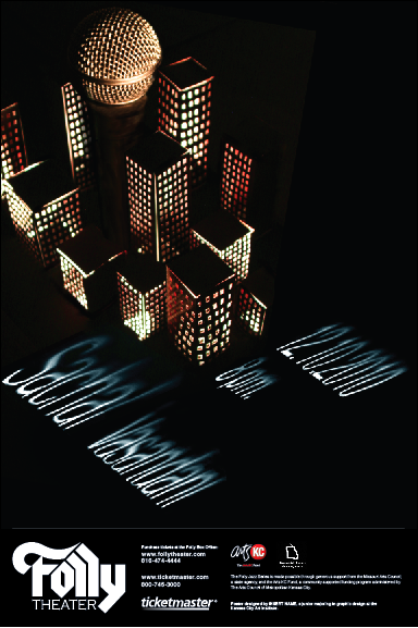
The next critique for these sketches narrowed my focus down to my hyperbole idea. This was the last image with the microphone hidden in the landscape. The city really reflected his big voice in a big city, while remaining true to his modern/ indie style of Jazz. I also loved just how geometric a common building facade was. So with idea in hand, we started making digital iterations of the poster. The media used to make the poster was left up to use. You could use water color, photography, pencil, the computer, whatever. I did a combination of photography and illustrator.
The illustrator posters ended up looking far to flat and didn't really speak much to Sachal's style and warmth. The photographic one however, with the lit up city turned out interesting. I had to create a small city out of paper and lit it from underneath. The microphone however, was not coming across as a microphone at all and there would have to be some major work done in terms of craft and typography. Further iteration was needed, so I began making more buildings and reshooting them with a better camera. I also checked out a real microphone and shot it under dark light to place it in the city separately.
In the first 3, I cut out the text and lit it to get the shadows. I wanted to use lighting to tie the text in with the lit city, but the text came out looking quite scary actually, and difficult to read. So I returned to vector and illustrator in the 4th poster, and continued with that same idea of putting text on a plane. It was certainly better, but still needed work, and the amount of buildings and such were far to many.
The color of the light was also a little stark, so I turned up the saturation a bit and added some warmth to the poster. I also separated the type in a name group and information group, so that the viewers eye were travel across the poster. I photographed light and shadow and brought it into the type so it wasn't such a flat plane of color and would mimic the darkness at the base of the buildings.
I ended up choosing the layout of the 1st poster, but there needed to be more space and some more treatment done to the type's perspective. The purple also wasn't speaking much to the mood boards colors, and didn't really represent Sachal all to well. So After going through greens (too alien), orange and reds (to monochromatic), I finally settled on blue, which I love. Below is the final poster.
The blue really pops, and gives a feeling of sky with it's texture, which really speaks to me. The dark city representing Jazz clubs and the Jazz scene, while the sky represents Sachal Vasandani's airy and open music.
The final step was to make our posters black and white, and place them into new formats to fit in magazines and papers as an advertisement.
So the final critique is today, combined with a public showing of all of our posters. Many people including the faculty and a representative from the Folly will come and based on what they see, choose the poster they think works best. I'll let you all know if mine makes the cut. Thanks for reading!
So the below is my gathered research on Sachal Vasandani, my jazz vocalist I'm to do a poster for at the Folly theater. I apologize ahead of time for the long post, perhaps next time I'll just make it a pdf.
Questions to ask the Folly:
1. How important is it to include the other band members?
The band
Jeb Patton- piano David Wong- bass Quincy Davis- drums Justin Brown- drums Dayna Stephens- tenor & baritone Vincent Gardner- trombone
Barns and Noble biography
Sachal Vasandani was born in Chicago, and listened to his parents' modern jazz records, pop music by the Beatles and Michael Jackson, and the East Indian music of his heritage. In college at the University of Michigan he studied economics, and was instructed in the U-M's jazz and classical music programs. Arriving in New York City as a Wall Street investment banker, Vasandani soon discovered the lure of music was too strong. He found himself talented enough to make a go as a jazz vocalist and worked local jazz clubs. Wynton Marsalis and the Lincoln Center Jazz Orchestra gave him a chance to front a big band. After two independent recordings, his major-label debut for the Mack Avenue label, Eyes Wide Open, was issued in 2007. It reflects his past and identifies him somewhat as a pop-jazz crooner who incorporates elements of rock, R&B, classical, and Brazilian musics. Possessing a pleasant, flexible, and understated voice influenced by the subtleties of Shirley Horn, he will occasionally employ scat phrasing and vocalese. He was a winner in the 1999 Downbeat magazine Student Jazz Awards in the Collegiate Vocal category, and earned a semifinalist berth in the 2005 Thelonious Monk Institute Competition. As a sideman, he has worked with Pyeng Threadgill and Sean Jones. ~ Michael G. Nastos, Rovi
Reviews and Comments
"What makes a jazz singer has more to do with a set of tools and instincts, and by that measure Sachal Vasandani qualifies as one of the stronger new arrivals in the field....The best news about “We Move” is that Mr. Vasandani seems comfortable with precedent as well as freedom. But it’s also clear that he’s a jazz singer with good ideas, including some about what a jazz singer can be."-
-The New York Times
"With his 2007 debut Eyes Wide Open, Sachal Vasandani did his part to reshape the role of the male jazz vocalist for a new era. He’s far from a contrived neo-Sinatra but a cool customer nonetheless, with strong standard-repertoire chops as well as an ear for unerring pop melody"
-Philadelphia Weekly
Without making an attempt, always doomed, to define jazz singing, suffice it to say that Vasandani does it and does it well. Jazz is in his phrasing, intonation and dynamics, whether on a chestnut like “Don't Worry About Me" or his own songs “Every Ocean, Every Star" and the title tune. His voice has a reedy quality that maintains through the registers of his considerable range and his note manipulations.br /> -All About Jazz
"Even more telling is the example of Sachal Vasandani, a prepossessing recent arrival whose sophomore album, We Move (Mack Avenue), is among this year’s best vocal releases. On it he contributes several of his own tunes, pays homage to Hendricks and Murphy, and interacts sure-footedly with a dynamic working band. His take on the standard “Don’t Worry About Me” involves a lilting “Poinciana” groove, over which he phrases in long arcs; the whole package suggests Elling on “My Foolish Heart” a decade ago. And one of the originals, a near-bossa called “Royal Eyes,” incorporates a distinctly Elling-esque reading, complete with subtly multitracked background harmonies." -Jazz Times
"the terrific pacing and charismatic interpretations on his sophomore CD We Move really grab the attention. The singer's self – penned contributions rank especially highly, whether it's prefixing a brief, minute-long fragment to provide a subtly diferent context for a standard, delivering the tender ruminations of 'Every Ocean, Every Star', or enveloping the vocal line with the magnificently full textural paette of the anthemic 'Hearbeat'. As evidenced by an impressive 'Monk's Dream' he's also something of a Thelonious fan, which can only be a good thing. The singer has been performing with his core quartet of Patton, Wong and Davis since 2001 and there's a palpable sense of a deep musical familiarity and understanding amongst the group which can often be lacking from vocal jazz recordings." - “ < -Jazzwise (UK)
More onEyes Wide Open:
"Vocalist Sachal Vasandani bridges the jazz and pop worlds with "Eyes Wide Open," his superb debut of distinctive originals and intelligent makeovers that teem with fresh vitality".
-BillboardMagazine
"It’s not often that a male singer makes a noteworthy recorded debut, so when it happens, it’s worth checking in... On first listen, ‘‘Eyes Wide Open’’ impresses with restraint; Vasandani favors control over ornamentation, and many of the songs own the refined nocturnal hush that comes from unhurried exposition and impeccable piano-trio arrangements. Vasandani’s keen intimacy with his core group... shows throughout, and the guest contributions...are just as fluid and easy".
-The Boston Globe
"Mr. Vasandani is a bright young jazz-pop singer with charisma to spare, as he demonstrates on “Eyes Wide Open” (Mack Avenue), his self-assured recent debut."
- The New York Times
"(he) has a supple voice, warm and communicative enough to court the Norah Jones crossover crowd, while remaining pliable enough not to alienate diehard jazz fans. Besides his own tunes, Vasandani shows a keen ear and open mind for material.... Vasandani shows a wealth of promise"
--The Philadelphia Daily News
"An impressive and highly original new voice on the jazz scene, Sachal Vasandani etches emotional ambivalence with a rich, deep voice that surfs the vivid nuances of jazz while flirting with pop and blues. His preference for exploring the shadowy realms of ambiguity results in gorgeously muted colors on his new album, Eyes Wide Open (Mack Avenue). His three originals grapple with doubts about faith, forgiveness, and the future, while his striking cover of the ballad "I Could Have Told You" sifts through layers of heartache..."
-Minneapolis City Pages
"Vasandani is the total package—good looks, polished stage presence, easy rapport with the audience, and just enough swagger to exude confidence well short of arrogance. But it isn’t just the wrapping—vocally Vasandani delivers, be it ballad (“You Won’t Forget Me”) or blues (“Strange Things Happening), original (”Storybook Fiction”) or classic (“Anything Goes”). And while his style is as sophisticated and erudite as a veteran jazzman, his warm baritone and respect for the lyric create immediate accessibility and intimacy—a combination that should pull in fans of Harry Connick and even Norah Jones as quickly as fans of Kurt Elling or Shirley Horn. "
-Jazz Police
“Precious few new artists.. are capable of quickening the pulse...It’s a sophisticated but not esoteric palette of tunes, and Vasandani’s treatments bind them together without any strain of conceit"-
-Minneapolis Star-Tribune
“Sachal Vasandani, the unsung hero of this summer's Freihofer's Jazz Festival… a song stylist who has produced one of the best discs of the year. He's well versed in the "Great American Songbook" but unlike many emulators he's savvy enough to pepper his repertoire with a new generation of standards. On his own material, like "Please Mr. Ogilvy," he shows a biting wit that's often masked by the soothing nature of his music.”
-Glenn Falls Post-Star
"..An awesome young male singer who (has) the chops, the smarts, and the charisma...to forge a genre of his own that combines jazz with elements of folk and pop"
-New York Sun
PRAISE FOR “WE MOVE”
"Vasandani feels comfortable with precedent as well as freedom."
- New York Times
"...one of the best vocal releases of the year..."
- Jazz Times
"the terrific pacing and charismatic interpretations on his sophomore CD WE MOVE really grab the attention"
- Jazzwise (UK)
"Young singer Sachal Vasandani has a voice that is calm, deep and, for this tune, light. "
- NPR- recc for "Travelin LIght" from We Move
"strikingly original and inventive compositions..a calm, ruminative wisdom and beautifully showcase Vasandani's creamy, melancholy sound""
- MOJO (UK)
"A man in the middle singing his soul out"
- Huffington Post
"..above all, an excellent singer"
- Jazzman (France)
"there's no disputing the jazz credentials of the effervescent young vocalist...Sachal Vasandani
- New York Times
"classic vocal style"
- Vanity Fair
"warmly regarded young romantic crooner"
- Time Out New York
"In the spirit of his great inspirations, such as... Shirley Horn,Vasandani focuses on relaxation, elegance and understatement."
- NDR (germany)
"Vasandani really has something new to bring and creates such intimacy in his phrasing"
- Edge Publications
"Musical omnivore"
- New York Times
"...an eye-opener to a fresh, young talent who displays a singular, deep-brewed voice…"
- Flyfi
"Red-hot…the finest young talent on the scene. "
- Jazz at Lincoln Center
"haunted, a little fragile, rooted in focused solitude"
- NY Times
"Rising Star"
- 2009 DownBeat Critics Poll
"…jazz singing is alive and doing great because of this talented young man."
- Sheila Jordan
We Move
"My music always starts off with jazz, but can end up in any number of places because of all my different influences. I guess I value the freedom to explore as much as the discipline of tradition." –Sachal Vasandani That's Sachal Vasandani reflecting on the adventure he's embraced on his captivating sophomore CD, We Move, on Mack Avenue Records. Produced with a team of top-flight studio sages (John Clayton, Doug Wamble and Al Pryor), We Move finds the young jazz vocalist (who also serves as a producer) maturing as songwriter, tune stylist and bandleader in the wake of his breakout 2007 debut, Eyes Wide Open (Mack Avenue Records). That exceptional CD made for one of the most startling revelations of the year – a fresh, young vocal talent who displayed a singular, deep-brewed voice and possessed an uncanny sensibility to straddle the fine line between jazz and pop with songs that teemed with emotion and intellect. In regards to We Move, Vasandani says, "I wanted to continue telling my own story, to write about my own, visceral experiences without force feeding. I tried to share the surface of an emotion but hint at the iceberg below, and then let the listener find their own depth."
After two years of touring and with a renewed confidence in composing and arranging, Vasandani decided it was time to beginWe Move. "On the road, I would gather my ideas any way I could, and then lock myself away and mold the music to fit my emotions," says the vocalist who was a semi-finalist in the 2004 Thelonious Monk Institute Competition. "I ended up writing 30 to 40 songs in all kinds of styles and about all kinds of topics."
Ultimately, his work narrowed to the songs here: original lyrics and music, band arrangements, and older tunes augmented by new sections. As for his team of producers (Clayton and Wamble both contributed to his debut outing), Vasandani says, "Doug and I would work around tracks we had laid down, experimenting with sounds, voices, guitars that would best serve the atmosphere we were after. We did that for a month before going into the studio again. And I remain in awe of John's ability to hear what I am after and lead me to the answer. Plus, he looked after my voice with such care."
Signed to Mack Avenue Records in 2006, Vasandani was born in Chicago and grew up in a household where all kinds of music were appreciated. His parents listened to a variety of jazz, from Duke Ellington to Keith Jarrett, which piqued his curiosity. In pursuing his love for music at the University of Michigan, he began to be recognized as a talent of the future, most notably by DownBeat magazine, which awarded him Collegiate Jazz Vocalist of the year in 1999.
After moving to New York, Vasandani quickly became a part of the jazz scene, and made a musical home in storied clubs like the Zinc Bar. He was also tapped for a number of guest performances and recordings, notably by the Lincoln Center Jazz Orchestra with Wynton Marsalis, Wycliffe Gordon, Eric Reed, T.S. Monk, and countless other peer and mentor musicians.
After Vasandani's break-through debut recording, he toured extensively supporting Eyes Wide Open. He opened for such disparate artists from jazz trumpeter Chris Botti to pop singer Joan Osborne, garnering respect from a diverse spectrum of audiences. "I played in the US as well as overseas," he says. "I played at jazz festivals as well eclectic venues, and it was humbling to see people with different backgrounds and tastes respond to what I do."
In addition, Vasandani was mentored by the veterans of the jazz vocal realm. He shared the stage with Jon Hendricks at a masters and mentors concert in Idaho ("Jon's honest spirit, intellect and improvising ability are such an influence"), and toured Japan with Sheila Jordan. "Sheila serves as a mother figure to a lot of us singers," he says. "Like Jon, Sheila sings powerfully and with so much love. To keep your voice, spirit, energy alive, night after night, for decades – what an instruction in longevity."
Yet, while Vasandani was riding high on the success of Eyes Wide Open, "I was hitting a low point emotionally. My relationships broke, I couldn't really face my own problems and I lost both of my role models – my grandparents. I went to India to see them when they were hospitalized, together. Although it was a thrill to be making music, I was felt like my life was falling apart. My music and the rest of my life were moving in opposite directions, further and further apart. That's when I started writing songs for We Move, in order to come to terms with myself, to select the right songs to understand myself better."
OnWe Move, Vasandani has ample support from his trio comprising pianistJeb Patton, bassistDavid Wongand drummerQuincy Davis. A rarity in jazz these days, Vasandani and Co. have a longevity factor working in their favor: The band has been a group since 2001. "Those guys are like family in the best way," says the leader. "We've known each other and worked together for so long that they're forthcoming in feedback and are extremely confident. Yes, we like to experiment, but the four of us are also deeply indebted to the tradition; there's a respect for music that balances our wilder sides."
Vasandani notes that in addition to their instrumental support, two band members also contributed songs, including Patton's "Horizons" that is paired with the romping, upswing "Once in a While" (by Michael Edwards and Bud Green), and Davis composed the music on "Ring Road (Back to You)," which the leader wrote the lyrics to. Of the former, Vasandani says, "There are so many reasons to sing that song. The coy lyric fits my m.o. lyrically. And by pairing that tune with Jeb's intensely swinging original, we can shift the focus a bit to the band while I can still float out on top."
As for the latter, Vasandani says that it is the CD's oldest number in the band's library. "This is a song the band can relate to," he says. "Over the years the song took on different shapes as we continued to make new arrangements. But Quincy's melody was always so easy to sing, from the beginning."
In addition to producing, Wamble plays a significant role as a guest musician onWe Move, adding various guitar styles, background effects, layering and texturing on several tunes. Other guests include drummer Justin Brown, trombonistVincent Gardnerand tenor/baritone saxophonistDayna Stephens.
Vasandani's originals are among the standout tracks onWe Move. The gem of the bunch, "Every Ocean, Every Star," features Wamble's layered guitar textures. "This is a song about expectations," says Vasandani. "It's a beautiful thing to try to give without expectations, but can we really? I wrote this song for the people I'm closest to."
The title track, written with Vasandani's friend Erik Privert, has a movement that's both mysterious and sweet. Vasandani's lyrics on this record, beginning with "We Move," reflect his struggle "to accept myself without guilt." Another jewel is the lilting "Royal Eyes," again infused with Wamble's guitar colors and embellished by Vasandani's overdubbed background vocals. "The song is a reminder for me to love what I have. Even though this song has a folksier feel, I wanted the colors of the other voices to be messy, human."
In addition to his originals, Vasandani puts his spin on songs from the jazz songbook and canon, including the bright CD opener, Rogers & Hart's "There's a Small Hotel" with a Vasandani intro ("Escape") that gives the standard a fresh feel. Also on the CD are a hip, funky take of "No More," the Hubert Laws/Jon Hendricks 70s song; the Bloom/Kohler tune "Don't Worry About Me" that's played as a ballad but with a rhythm reminiscent of the Ahmad Jamal staple, “Poinciana;” the sexy, low-lights romance through "There Are Such Things" (by Stanley Adams, Abel Baer, George W. Meyer); a cooking romp through "The River of St. Marie" put on the map by Joe Williams; and Thelonious Monk's "Monk's Dream" (with lyrics by Hendricks) that Vasandani says pays tribute to the piano giant's "unfettered, creative spirit. I love most all of Monk's music. Of course, he's known for unusual harmonies, but his melodies are so catchy."
Another We Move highpoint of Vasandani's creativity comes in his popish "Heartbeat," which he says was "one of the most fun songs to realize" on the album. With a full color palette ranging from horns to guitars, the romantic, deceptively innocent lyric gets a sonic "cushion that really moves it along." That's followed by the end song, the Jimmy Mundy-Trummy Young-Johnny Mercer beauty, "Travelin' Light." It serves as the perfect cap to the proceedings. "It's like a little coda," says Vasandani. "We've been building through the record, and finally we come to 'Heartbeat,' which is huge the whole way through. At the very end, I figured, let's just be a little quiet."
Mood Board
Colors and Textures: Blues, Greens, reds and passionate colors, Greys, unsaturated colors, sepia tones, Indian Patterns, Sandstone, Slate