So the final critique for the modes of appeal project starts tomorrow. This post will show some of my process throughout the project and explain some of my concepts and reasonings.
To start out the project, we learned about the 3 modes of appeal, and how to use those effectively to persuade an audience. The project was to redesign a products packaging using the 2 modes of appeal that it isn't currently using, and to make it look better of course.
For my packages, I chose Mrs. Meyers basil liquid hand soap, SoyJoy fruit and nutrient bars, and Nescafe instant coffee. The 3 backages were different materials and had considerably different forms. Mrs. Meyers was using Ethos, SoyJoy was using Logos, and Nescafe was using Pathos.
After passing our package choices by Jamie, we started doing thumbnail sketches for each product, attempting to create concepts for the 2 modes of appeal that each product was not utilizing.
My best sketches seemed to be SoyJoy's. I think I might have been biased toward SoyJoy from the beginning, but the relation between fruit and the human body was an interesting concept. After deciding on which package we wanted (SoyJoy), then we began a round of digital iterations. I also couldn't find an online eps of SoyJoy's logo, so I had to vectorize it myself.
The Berry direction worked best for Pathos. The bright colorful and fresh fruit helps to pull at the consumers hunger and healthy habits, while the words represent the benefit of each berry eaten. For Ethos, I liked the direction using a SoyJoy bar in place of a fitness aid. This created an interesting dialogue between the importance of SoyJoy's nutrients, and the activities of reliable and consistent athletes. They create a sense of trust in the consumer that SoyJoy is a necessity to their diet/ work out routine.
The Berry direction however was too crowded, and very illegible. The full bleed imagery also didn't work well with SoyJoy's persona. The bike direction also didn't hit it off to well with my peers, and while working, the idea of being 100% U.S. grown popped into my head.
With our concepts firmly in hand, we began to fully design them, and mock them up in real size. The photographic images in both directions switched into vector artwork, using flat plains of color and representing the simplicity of ingredients that SoyJoy uses in their ad campaigns. I created my first box, designing around the sides for my Ethos direction, and I created many iterations for the placement of text and image for my Pathos direction.
The colors needed to be worked out for the Ethos direction. The soil was too dark, and the sky wasn't quite blue enough.
The side was also begging for a mission statement. I digitalized the nutrients table so that it would be clear, and because I thought it was a necessary experience. Overall, the design for the box went well, and I moved on to the final box. As for the Pathos direction, I chose a pale yellow, with luscious reds and magentas for the berries. Things popped, and I moved on to designing the final box for it as well, using the same template as the Ethos box. The berries were arranged in a sort of balancing act, reflecting the life of the consumer.
Showing posts with label Documentation. Show all posts
Thursday, October 28, 2010
Monday, September 20, 2010
Folly Poster Documentation
In our visual language course, the class was tasked with creating a poster for a select Jazz artist performing at the down town Folly theater. We were first paired with another peer, my partner was Vi Pham, and we began gathering research on their musical career, style, instrument, other band members, etc. Vi and I were assigned Jazz vocalist Sachal Vasandani. It's been a great project, and I love his music. Nothing but possitive feedback.
After the mood board, Vi and I split ways. The project was essentially a competition. The Folly will only choose one of the posters from our entire class to advertise at the Folly, so we all set off to make our own posters. From here, we created matrixes that taught us the use of rhetorical tropes such as Hyperbole, Pun, Metaphor, Synecdoche, Parody, Irony, and much more.
Using these tropes, we sketched little ideas for design motions in our posters. Here were a few of mine:
After a very specific and difficult critique of our matrixes, we set off to make 15 sketches of 3 of the matrix ideas in poster format.


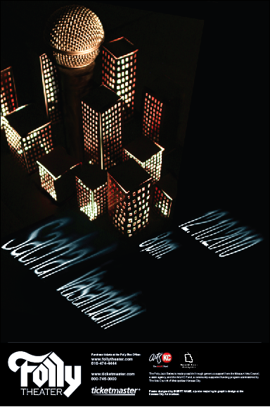
The next critique for these sketches narrowed my focus down to my hyperbole idea. This was the last image with the microphone hidden in the landscape. The city really reflected his big voice in a big city, while remaining true to his modern/ indie style of Jazz. I also loved just how geometric a common building facade was. So with idea in hand, we started making digital iterations of the poster. The media used to make the poster was left up to use. You could use water color, photography, pencil, the computer, whatever. I did a combination of photography and illustrator.


The illustrator posters ended up looking far to flat and didn't really speak much to Sachal's style and warmth. The photographic one however, with the lit up city turned out interesting. I had to create a small city out of paper and lit it from underneath. The microphone however, was not coming across as a microphone at all and there would have to be some major work done in terms of craft and typography. Further iteration was needed, so I began making more buildings and reshooting them with a better camera. I also checked out a real microphone and shot it under dark light to place it in the city separately.


In the first 3, I cut out the text and lit it to get the shadows. I wanted to use lighting to tie the text in with the lit city, but the text came out looking quite scary actually, and difficult to read. So I returned to vector and illustrator in the 4th poster, and continued with that same idea of putting text on a plane. It was certainly better, but still needed work, and the amount of buildings and such were far to many.
The color of the light was also a little stark, so I turned up the saturation a bit and added some warmth to the poster. I also separated the type in a name group and information group, so that the viewers eye were travel across the poster. I photographed light and shadow and brought it into the type so it wasn't such a flat plane of color and would mimic the darkness at the base of the buildings.

I ended up choosing the layout of the 1st poster, but there needed to be more space and some more treatment done to the type's perspective. The purple also wasn't speaking much to the mood boards colors, and didn't really represent Sachal all to well. So After going through greens (too alien), orange and reds (to monochromatic), I finally settled on blue, which I love. Below is the final poster.
The blue really pops, and gives a feeling of sky with it's texture, which really speaks to me. The dark city representing Jazz clubs and the Jazz scene, while the sky represents Sachal Vasandani's airy and open music.
The final step was to make our posters black and white, and place them into new formats to fit in magazines and papers as an advertisement.
So the final critique is today, combined with a public showing of all of our posters. Many people including the faculty and a representative from the Folly will come and based on what they see, choose the poster they think works best. I'll let you all know if mine makes the cut. Thanks for reading!
To give you a bit of an idea to what we had to work with, here is a link to his music. Take a bit and enjoy.
http://www.myspace.com/sachalvasandani
So to start, we created a mood board. This essentially was a collection of imagery, colors, typography, just about anything to hint at the mood, style, pretty much what Sachal and his music "are".
Colors that seemed to fit reflected his calm, modern, and experimental style. The typography followed suit in the forms of modern san serifs. Sachal has always been a city dweller, and has a very sophisticated air about him, so modern architecture also found its way in. The placement of the imagery could have used a bit of work looking back on it. Probably something more organic and free.
After the mood board, Vi and I split ways. The project was essentially a competition. The Folly will only choose one of the posters from our entire class to advertise at the Folly, so we all set off to make our own posters. From here, we created matrixes that taught us the use of rhetorical tropes such as Hyperbole, Pun, Metaphor, Synecdoche, Parody, Irony, and much more.
Using these tropes, we sketched little ideas for design motions in our posters. Here were a few of mine:
After a very specific and difficult critique of our matrixes, we set off to make 15 sketches of 3 of the matrix ideas in poster format.
The next critique for these sketches narrowed my focus down to my hyperbole idea. This was the last image with the microphone hidden in the landscape. The city really reflected his big voice in a big city, while remaining true to his modern/ indie style of Jazz. I also loved just how geometric a common building facade was. So with idea in hand, we started making digital iterations of the poster. The media used to make the poster was left up to use. You could use water color, photography, pencil, the computer, whatever. I did a combination of photography and illustrator.
The illustrator posters ended up looking far to flat and didn't really speak much to Sachal's style and warmth. The photographic one however, with the lit up city turned out interesting. I had to create a small city out of paper and lit it from underneath. The microphone however, was not coming across as a microphone at all and there would have to be some major work done in terms of craft and typography. Further iteration was needed, so I began making more buildings and reshooting them with a better camera. I also checked out a real microphone and shot it under dark light to place it in the city separately.


In the first 3, I cut out the text and lit it to get the shadows. I wanted to use lighting to tie the text in with the lit city, but the text came out looking quite scary actually, and difficult to read. So I returned to vector and illustrator in the 4th poster, and continued with that same idea of putting text on a plane. It was certainly better, but still needed work, and the amount of buildings and such were far to many.
The color of the light was also a little stark, so I turned up the saturation a bit and added some warmth to the poster. I also separated the type in a name group and information group, so that the viewers eye were travel across the poster. I photographed light and shadow and brought it into the type so it wasn't such a flat plane of color and would mimic the darkness at the base of the buildings.

I ended up choosing the layout of the 1st poster, but there needed to be more space and some more treatment done to the type's perspective. The purple also wasn't speaking much to the mood boards colors, and didn't really represent Sachal all to well. So After going through greens (too alien), orange and reds (to monochromatic), I finally settled on blue, which I love. Below is the final poster.
The blue really pops, and gives a feeling of sky with it's texture, which really speaks to me. The dark city representing Jazz clubs and the Jazz scene, while the sky represents Sachal Vasandani's airy and open music.
The final step was to make our posters black and white, and place them into new formats to fit in magazines and papers as an advertisement.
So the final critique is today, combined with a public showing of all of our posters. Many people including the faculty and a representative from the Folly will come and based on what they see, choose the poster they think works best. I'll let you all know if mine makes the cut. Thanks for reading!
Friday, April 16, 2010
VisCom2: Infograph Process
So the info graphics are all settled into the magazine spread. This post will just serve as a catch up, and so you can see my process from the initial ideas to the final deal.
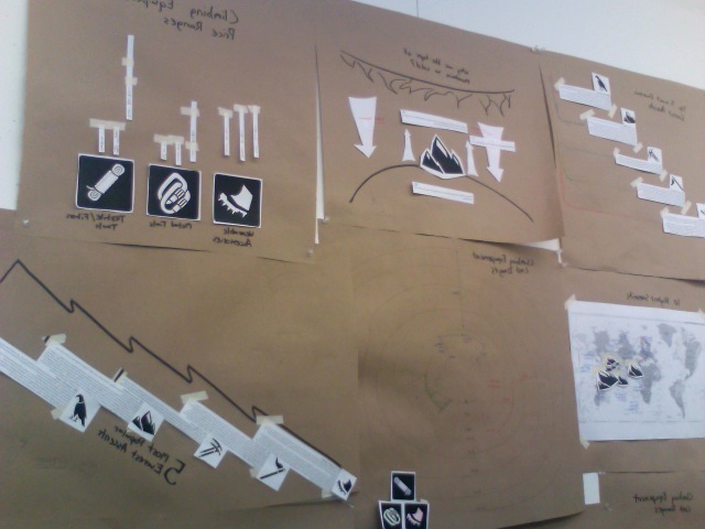
So we started with simple paper mock ups to get our concept down.
After choosing which concepts worked best for our magazine spreads, I started to do some more complex sketches that brought the info graph into a more visually pleasing format. Some of the paper infographs had to be combined into a single new info graphic style in this process.
After the sketches passed critique, we had to take what we had into the digital realm.

After the digital round, it got a bit challenging. Getting them into the magazine spreads from type2 meant changing scale and moving certain elements in our info graphics to suit our magazine layouts. Some things had to be compromised and changed in the process, but overall, I thought they turned out quite nicely.


So we started with simple paper mock ups to get our concept down.
After choosing which concepts worked best for our magazine spreads, I started to do some more complex sketches that brought the info graph into a more visually pleasing format. Some of the paper infographs had to be combined into a single new info graphic style in this process.
After the sketches passed critique, we had to take what we had into the digital realm.

After the digital round, it got a bit challenging. Getting them into the magazine spreads from type2 meant changing scale and moving certain elements in our info graphics to suit our magazine layouts. Some things had to be compromised and changed in the process, but overall, I thought they turned out quite nicely.


Subscribe to:
Posts (Atom)