- Line Book
- Hafnium Project
- Everest Magazine
- Taxonomy Project
- 3d Letter Form
- 7 Sins in Light
- 6 Degrees
- Bradbury Thompson Poster
- Icon System Book
I'll start by discussing the Line Book. It showed relations between both graphic vector forms and formal photography. The exercises in that project really took over, and we got quite experimental with different media, hands on processes, and even photography of the vector lines in the environment via projection. This also let me experience projection through lenses and the warping it causes.


The line book was also our first accordion book. This helped me visualize the book as a whole since it could all unfold and be seen as a long section rather than individual pages. This forced me to make formal relationships in the page order process, and made me consider the narrative of my travels when taking the photography.
From there I want to move on to the Hafnium Project. In this project I started to learn about type and how to place it all within a horizontal magazine composition, and then later, a vertical web page format. We had to create a memorable logotype that communicates well and holds up to different size applications. We also practiced hierarchy with scale, typeface choices, kerning between letters, leading between lines, and working with the rags and alignment of type. We also had to create an aesthetically pleasing composition utilizing this type with imagery dealing with our elements.


This followed through to the Everest Magazine project. All the spacing and hierarchy lessons carried over from the Logotype project, but this time, we had to work specifically for the magazine. The layout had to be better designed, and had several pages rather than 2. I learned how to use seperate articles in the same layout and had to create ways to differentiate them in a sort of system. Using full bleed imagery to create a documentary sort of feel, also created legibility issues I had to work with. The info graphics also had to be designed around, and accommodated for in our layout space, as well as adapted to fit the other design choices and type choices we made in the layouts.


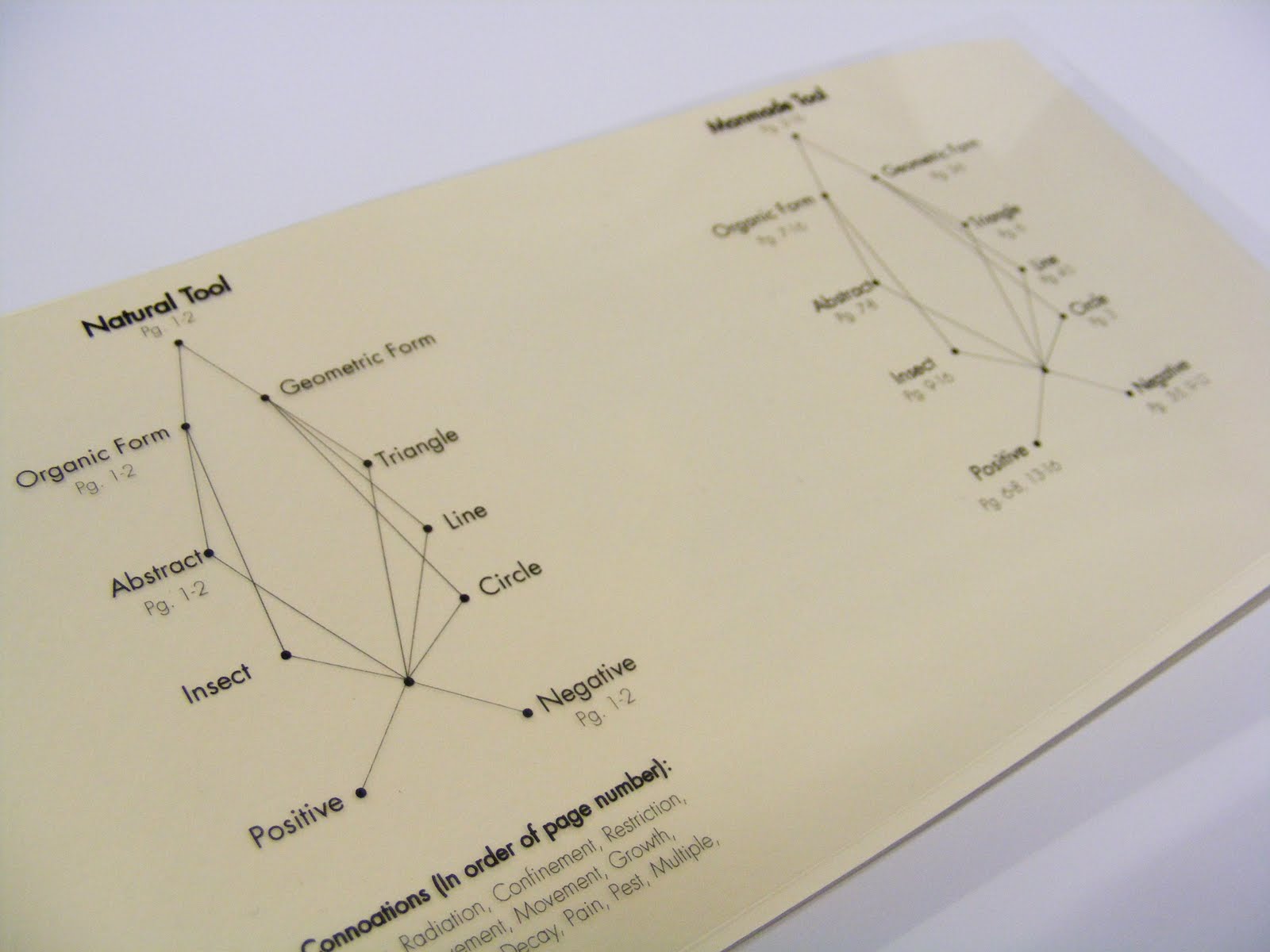
The taxonomy book project reverted back to the multimedia experience of the line book. We began with an analog method of mark making, using various tools and ink on paper. Our tools reflected the mark we were attempting to make, that would add further meaning to our haiku's. After creating those marks, we adapted them to a classification system and bound that in a book in whatever format we chose. I used an information graphic style table of contents for my book and used a theme of transparencies to see the marks together. A longer page was made to see each page individually as well. Working with transparencies required me to learn how to overlap pages without overlapping type and compromising legibility for looks.




The 3d letter form project required a different view of perspective on typography in space. The previous projects placed text on a 2 dimensional plane, so we were challenged to bring a letter form into a real space, through precision crafted sculpture. I chose the Kabel capital W, and wanted to create a vanishing point on one side of the 3. I wanted to use the letters architectural and art deco feel to be complimented by it's 3 dimensional aspects. We also photographed and vectored images of our letter forms, allowing use to apply different color schemes to the planes our letters created.


The color followed into the 7 Sins in Light project. This book challenged me to represent the seven deadly sins, and I challenged myself further by doing it with colored light and long exposures of a camera. I had to learn the corresponding colors to each sin, and create compositions that would also reflect them. This all had to be done within a 10 second exposure in a pitch black room. I also referenced the colors in the books table of contents and cover as another system similar to the taxonomy projects table of contents.


The 6 degrees project was also strongly rooted in photography. Rather than representing the sins, we had to advertise for the National Geographic Movie "6 Degrees Could Change the World". We had to create an informational design that could cross various formats (DVD, poster, DVD menu), and still look cohesive. We used a blue sky and industrial imagery in the background to root our topic in CO2 emissions, and to help give us enough space for text. This was especially important in our poster where we used green tips as an informational element when the viewer would get closer to the poster. In this way, we also worked with layers of viewing, and how size of typography helps to create that hierarchy. We used the CO2 Molecule as a consistent element through our system to hold both type and image.
The Designer Poster for type was a great hierarchy experience. We had to use elements of another designers style and create a full sized poster for a hypethetical lecture at our Epperson Auditorium. Using type at huge scales, and working with the layers of viewing that we used in the 6 degree project became our challenge. Bradbury Thompson used many moving images and overlapping fields of color to convey an Idea. I had to drop many first ideas, eventually shooting people moving throughout the audience seating area of the lecture hall. To create visual depth, I placed type behind sections of the background to obscure them and create visual interest. My color palette was both masculine and modern.

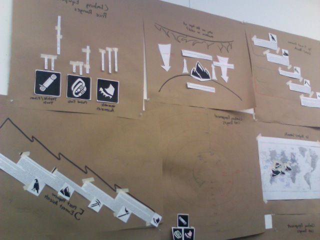
The Icon Merchandising System Book became our first taste of branding, and mocking up various forms of advertising. We had to work under a pre-designed logo for the Smithsonian, and apply that to a design system all our own. I decided to push the winter theme of my icons and used fitting merchandise like Carabiners, Winter hats and scarves, and stamps to use while traveling. My concept behind my Smithsonian was a mix of Pattern and masked imagery inside my logos to create instances of Relay. For example, my tent shows imagery of a turtle shell, meaning it's portable and is a form of protection and home. The Ice axe pattern forms a ladder, meaning ascension. And the crampon boot icon creates a tire tread pattern, emphasizing it's purpose of traction on icy surfaces. The type lock up that I used for the exhibition series creates a mountain, visually leading your eye over a peak.