Showing posts with label Info Graphic. Show all posts

Monday, February 28, 2011

Information Architecture: Starting the Info-graphics

So last class period, we began by organizing out collections on a series of index cards. The placement of these index cards in relation to each other revealed different cataloguing methods and helped us sort information of each item into categories for our website info-graphics.

Here are a few of the cameras in my collection. I will be receiving more shortly and will post those photos of the expanded collection at a later date.


Here are my initial sketches and brain storming lists.


For my main 3 cataloguing methods I am going to sort the cameras by their:

1. Camera Type
2. Monetary Value
3. Condition

My info-graphics so far include:

1. Number of steps to take a photograph
2. Camera Viewfinders
3. Monetary Value: Ebay Vs. Amazon
4. Film Formats
5. Bellows Camera Parts
6. Image Size
7. Location of Manufacture
8. Size and Weight
9. Time of Manufacture

Friday, April 16, 2010

VisCom2: Infograph Process

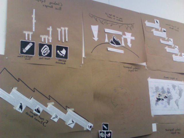
So the info graphics are all settled into the magazine spread. This post will just serve as a catch up, and so you can see my process from the initial ideas to the final deal.

So we started with simple paper mock ups to get our concept down.


After choosing which concepts worked best for our magazine spreads, I started to do some more complex sketches that brought the info graph into a more visually pleasing format. Some of the paper infographs had to be combined into a single new info graphic style in this process.


After the sketches passed critique, we had to take what we had into the digital realm.


After the digital round, it got a bit challenging. Getting them into the magazine spreads from type2 meant changing scale and moving certain elements in our info graphics to suit our magazine layouts.  Some things had to be compromised and changed in the process, but overall, I thought they turned out quite nicely.


Wednesday, April 7, 2010

Music Graphic

Just an interesting video I caught on Today's Big Thing.  I've been looking into motion graphics lately, and I thought this blended well with the vector work we are doing with our info graphics right now.

http://music.todaysbigthing.com/2010/04/01?utm_source=twitterfeed&utm_medium=twitter

Friday, March 26, 2010

VisCom2, Type2, Image Making: Inspiration

So this is an awesome example of our current project I ran across on flicker. Found it through the book cover archive blog site.
http://blog.bookcoverarchive.com/
Titled MAN AND SPACE

Graphics/Illustrations/progress/final photos of a redesign of 4 chapters from a classic educational book; Time Life Science Library's Man and Space. First printed in 1964.


This book project combines info graphics in a book format, and employs bodies of text not to different from our magazine layouts we are working with in Type 2.  I love the compositions, full bleed diagrams, and the playfulness with empty space. I hope that my compositions turn out just as great.
The use of line and the gradations that they used on them really adds a sense of depth to their otherwise flat, vector based art.

VisCom2: Ellen Lupton Info Graphic Reading "Diagram"

This section was particularly my favorite from the book thus far. I found myself marking several pages for different elements to consider. Both graphic use of line, and the wide variety of ideas was very helpful. She covered a wide range of ideas, and even the brief overview of Edward Tufte's sort of theory on info graphics provoked some thought. I'm torn between the idea of the absolute bare simplicity and minimalism that much successful design pulls from, and the extra fluff that adds character to it.  In the end however, I think I have to go against my initial instincts and love for minimalism and have to agree with Ellen on this issue. That fluff, or "chart junk" as Tufte puts it, is what often draws the viewer in, and really gives the designer the ability to express themselves and their style into the work. With the barebone approach that Tufte supports, the viewer is only approached with a simple graphic that gets the point across, but only leaves them with the knowledge. The designer doesn't leave much of an impact on the viewer in terms of their stylistic approach. And while I agree that the idea of the designer remaining annonymos is something beautiful, it tends to diminish the human designer into a designer, or group designers together as a whole.

A few elements I saw that I haven't really thought about are typography, transparency and overlapping, and being selective in what you show.  One reason why I've been straying away from location based diagrams so far is the showing of the map. There are so many diagrams that use the map. However, a few diagrams in the examples completely blew me away with their simple solution to their problem. One simply placed the dots/ icons on the map, and then deleted the map altogether, leaving only the distance between the points. This created simplicity and really played up typography and the graphic qualities of the colored lines they used.  Another diagram used only a few countries, but rather than using the whole world map, they only used those countries, and left the distance between the countries as an abstract thing by putting these countries that would normally be across the world from each other adjacent to one another.

Tuesday, March 23, 2010

VisCom2: Info Graphic Research

Okay, so here is research facts for 6 of my 9 icons from the last project. This data will be used in various info graphics for my magazine spreads.
http://www.scribd.com/share/upload/24493549/2h8rzzmfb6qesyxguvxu

Followers