So for the Book project, I started out selecting my 4 books. I wanted to really cover as best I could, the 4 main aspects of a climb up Everest. This would be climbing skill, mountaineering skills, maps and guides, and of course the psychological preparation for the climb.
Here are the final 4 I went with:
Everest: A Trekker's Guide by Kev Reynolds
Ice and Mixed Climbing: Modern Technique by Will Gadd
Into Thin Air by Jon Krakauer
The Mountaineering Handbook by Craig Connally
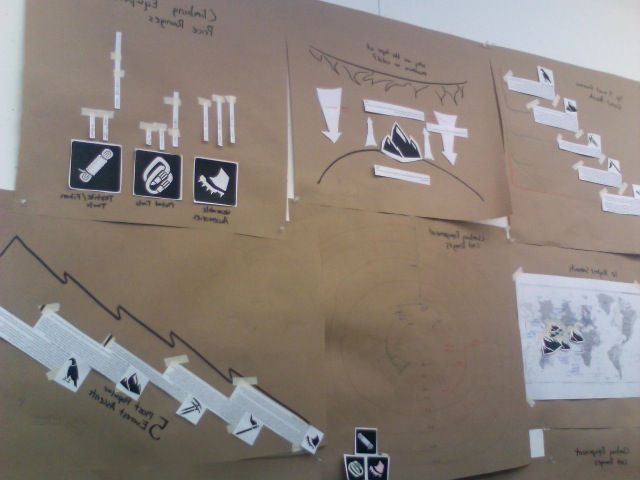
It hen started with a series of sketches on different ideas for the covers. I knew I wanted to base my designs around a banner.


The first set seemed to be the most thought out, so I continued with those and layered the icons in a more interesting way to come up with the final book designs. I decided to selectively fill certain areas of the icons in the background, and leave the other sections black. If it was all filled, their would be too much going on, and make it difficult to read text. For the banner, I decided to use routes up Everest instead of simple rectangle forms. The inside flaps have the name of the route shown on the cover, as well as a little info on it. I decided to stagger the banded sections on the spine to keep the author name and book title from overlapping any images. This way they are more legible. The drop shadows were put in under each layer to just give it a little more dimensionality.
So here is the final set for the "Ascending Everest" series:


This project was provided a challenge with the cohesive series, and the individuality of each book. Creating things that have similar elements and seem to belong to the same family, but at the same time, keeping them looking different enough to keep the viewers attention. The content in the imagery was also a major aspect of this project. I had to create a visual narrative by putting different imagery next to each other. In "Everest: A Trekker's Guide", I used photo imagery of Everest next to maps and vector imagery to give a sense of direction and movement. I also paired the book with my crampon/ boot icon to convey the sense of planting a footprint in untraveled wilderness. In "Ice and Mixed Climbing: Modern Technique", I Paired a verticle ice wall and climber with a series of carabiners and climbing rope. I wanted a bit more of a technical hand book feel to this one since it's a how to manual sort of book. This was also the reason I wanted the series to be small, so that they could be easily stored into a backpack, and brought out into the field if needed. "Into Thin Air" brought on the narrative challenge, since it's a novel. I wanted to create a visual account of the story, so I layered imagery through overlays and different ice textures. I had to learn to mix these images and overcome the frames and edges they all presented. They had to look like one image, rather than a few collaged together. So a man with his arm separated symbolizes the main characters arm that is amputated after his Everest expedition. The banner has imagery Tibetan prayer flags, that are commonly found at the base of Mountains in the Himalayas, including Everest. Finally, "The Mountaineering Handbook" is similar to the Ice and Mixed Climbing book, in that it's also a manual. So decided to show a boot print to symbolize that step out into unknown territory again in the icon. The banner shows A man standing at the summit of Everest in his moment of triumph.
Creating mock up books was a great experience. Being able to bring out work into a physical, hand held experience for our viewer is a must as designers. I'm sure they'll also appeal to any viewers in future internships as well. If I were to redo this project, I would definitely spend more time on the craft of my mock up books. The spines are slightly too large due to miscalculation in the folding of the cover's joints, so the coveres don't fit as well as they should have. My inside foam core pages are also a little small.