Wednesday, September 29, 2010

Type3: The type mailer

So in this new project for type3, we have to choose 2 existing typefaces that play well together, and create a type mailer that would hypothetically sell these to graphic designers. The mailer is a folded poster that would be placed in mailboxes and alert the designers to a new typeface or typefaces that they should buy.

So I chose Univers and Meridien, both typefaces designed by Adrien Frutiger. They are both highly adaptable, and similar in form while still contrasting in their little details.

So this is what I have so far for the poster side. I'll be printing it today to see where my folds hit, and that might change where I place my text. Can't have a fold running through paragraphs of type.

Narrative: The combination

So following the film canister project, and the history of lomography audio project, I've been tasked with combining these 2 media. This is certainly a learning experience in taking an existing project and reinventing it in a different format to work well with another existing project.

Now my dilemma is that I have text and audio, and they are both on different subjects. Can the human brain sift through 2 different channels of information and not become completely lost and thrown off?

So I'm taking the text from the film canister and taking the text into flash, where I can pair it with the audio. I'm hoping that by creating pauses in each of the 2 channels for the other to exist, alternating the channels if you will, that the confusion won't occur. Once the project is finished, I'll upload the flash file. Wish me luck!

Sunday, September 26, 2010

Visual Language Project 3: Packaging and Modes of Appeal

So here we are at project 3. Unfortunately I didn't get selected for the Jazz poster's that went to the folly, but maybe I'll have better luck next time a contest comes around. Anyway, we've moved on from Rhetorical tropes to a new thing known as "Modes of Appeal".

We've learned there are 3 of these:
1. Emotional (Pathos)
2. Logic (Logos)
3. Ethics (Ethos)

These are essentially channels employed in just about everything to appeal to us/ grab our attention. These are essential in package design, and that brings us to project 3 of the Visual Language course.

For this project we had to choose 3 different packaging solutions, 1 representing an example of each of the Modes of Appeal. We are later going to redesign the packaging for these products, using a different mode. This won't be redesigning the container necessarily, just the graphics on the packaging to better sell the product, and to appeal to the consumer in a different way.


So for my emotional piece, I chose this Nescafe Classic ground coffee product. The jar is glass, and it relies on a simple label to carry it's information. The imagery itself is what's doing the appealing. The coffee and warm tones rely on our wakened emotional state brought by coffee and the alert warm sensation it brings for our morning. It serves as a perk up and emotional lifter throughout the day, and the packaging uses these emotions to pull in it's customers.

Intended Audience: A bilingual group of average citizens who need a warm wake up routine in the morning to fall back on. This could be anyone from employed to students to the teenager trying their first cup. Nescafe, owned by Nestle, uses an image of a warm cup of coffee to appeal to the cold groggy morning individuals who need a little help to get started each day. The fact that it's an instant product also appeals to our impatience or short time for preparation before work and events. The warm tones give a sensation of happiness and readiness.


For logic, I chose a box of Soyjoy brand health bars. These contain many nutrients and fruits, and are formulated for a healthy body. The practical and simple packaging combined with the wholesome ingredients and message target an audience with a logical solution to a healthier body.

Intended Audience: A consumer seeking a healthier body using simple and noncomplex ingredients. Due to the nature of the packaging, they will likely be a gym member or fitness person of some sort. The packaging is simple and heavily geared toward the logos (logic) mode of appeal, with a lot of listed health information and they use the rounded square to bring in a similar formal element, almost making the package into an info-graphic sort of mode. The red color choices also relates to the berries used in the product, as well as promoting a genderless feel. Sure it's not a protein power mix, but it's not working in a female only way.


Finally, for my ethical mode packaging example, I chose a bottle of Mrs. Meyer's Clean Day liquid hand soap. The label and it's type around the bottle are very simple, carrying a simple message. The soap is aromatherapeutic, cruelty free, never tested on animals, and are biodegradable. The bottle itself is made with 25% post consumer plastic. These little things mount in the consumers ethical center, and convince the buyer that they are doing mother nature a service by using Mrs. Meyer's products.

Intended Audience: The house mom who wants a simple clean product for daily use within the household and with her children. The green generation are also included, because of Mrs. Meyer's highly ethical production process, cutting out wastes, cruelty, and harmful cleaning agents. The packaging is simple and modern with it's use of text and how information is worded and ordered. Younger generations will be drawn in with message and package design, rather than the product only targeting an older adult audience. The packaging is partly recycled as well, furthering their mission for environmentally friendly and simple products. 


Tuesday, September 21, 2010

Lomography Project 2 Statement

In the 2nd part of the Lomography project series, I attempted to make a handout using only typography. It was a difficult process that I'm still struggling to get right. The idea was design a series of "slides" with information describing Lomography and it's 10 rules to a new and unknowing viewer. I used a variety of colors for the type, but mostly kept things simple. I was hoping for my final product to be a film strip of photos taken from the printed text. I learned that by taking shots showing text that would come up in the next shot. This would create a feeling of simultaneity. The film would also be semi-transparent so you could hold the negatives up to the light to make the colors brighter and see things beyond the text in cases like my light leak and vignette filter panels. In order to get the colors right on the negative however, I learned that I have to shoot the colors inverted. I also figured out that shooting a flat black comes out more transparent than shooting white in film negatives. I guess I still have a lot to learn however, when it comes to light and film photography. My indoor lighting conditions weren't getting enough light to my film, other than the film rolls that turned out way over exposed, possibly due to heat from last summer, 4 of my 6 rolls turned out with nothing on them, completely underexposed. So I'm still learning to deal with that and I'll be redoing the project as intended at a later date.

In the meantime, I printed the text and attached it to the inside spool of an empty film canister. This represents the analog film used in Lomography, and creates a user experience and reading order as the viewer pulls the strip out of the canister to read it. I enjoyed learning how to open a film canister and close it back up.

Monday, September 20, 2010

Folly Poster Documentation

In our visual language course, the class was tasked with creating a poster for a select Jazz artist performing at the down town Folly theater. We were first paired with another peer, my partner was Vi Pham, and we began gathering research on their musical career, style, instrument, other band members, etc. Vi and I were assigned Jazz vocalist Sachal Vasandani. It's been a great project, and I love his music. Nothing but possitive feedback.

To give you a bit of an idea to what we had to work with, here is a link to his music. Take a bit and enjoy.
http://www.myspace.com/sachalvasandani

So to start, we created a mood board. This essentially was a collection of imagery, colors, typography, just about anything to hint at the mood, style, pretty much what Sachal and his music "are". 


Colors that seemed to fit reflected his calm, modern, and experimental style. The typography followed suit in the forms of modern san serifs. Sachal has always been a city dweller, and has a very sophisticated air about him, so modern architecture also found its way in. The placement of the imagery could have used a bit of work looking back on it. Probably something more organic and free.


After the mood board, Vi and I split ways. The project was essentially a competition. The Folly will only choose one of the posters from our entire class to advertise at the Folly, so we all set off to make our own posters. From here, we created matrixes that taught us the use of rhetorical tropes such as Hyperbole, Pun, Metaphor, Synecdoche, Parody, Irony, and much more.


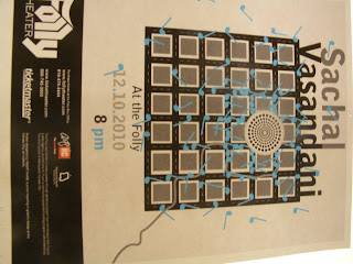
Using these tropes, we sketched little ideas for design motions in our posters. Here were a few of mine:


After a very specific and difficult critique of our matrixes, we set off to make 15 sketches of 3 of the matrix ideas in poster format.


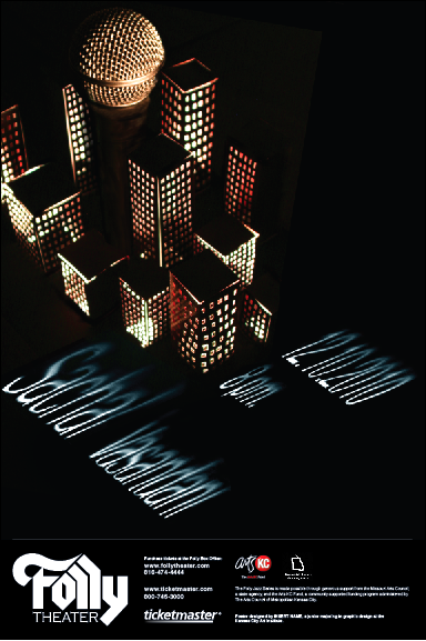
The next critique for these sketches narrowed my focus down to my hyperbole idea. This was the last image with the microphone hidden in the landscape. The city really reflected his big voice in a big city, while remaining true to his modern/ indie style of Jazz. I also loved just how geometric a common building facade was. So with idea in hand, we started making digital iterations of the poster. The media used to make the poster was left up to use. You could use water color, photography, pencil, the computer, whatever. I did a combination of photography and illustrator.


The illustrator posters ended up looking far to flat and didn't really speak much to Sachal's style and warmth. The photographic one however, with the lit up city turned out interesting. I had to create a small city out of paper and lit it from underneath. The microphone however, was not coming across as a microphone at all and there would have to be some major work done in terms of craft and typography. Further iteration was needed, so I began making more buildings and reshooting them with a better camera. I also checked out a real microphone and shot it under dark light to place it in the city separately.


In the first 3, I cut out the text and lit it to get the shadows. I wanted to use lighting to tie the text in with the lit city, but the text came out looking quite scary actually, and difficult to read. So I returned to vector and illustrator in the 4th poster, and continued with that same idea of putting text on a plane. It was certainly better, but still needed work, and the amount of buildings and such were far to many.

The color of the light was also a little stark, so I turned up the saturation a bit and added some warmth to the poster. I also separated the type in a name group and information group, so that the viewers eye were travel across the poster. I photographed light and shadow and brought it into the type so it wasn't such a flat plane of color and would mimic the darkness at the base of the buildings.


I ended up choosing the layout of the 1st poster, but there needed to be more space and some more treatment done to the type's perspective. The purple also wasn't speaking much to the mood boards colors, and didn't really represent Sachal all to well. So After going through greens (too alien), orange and reds (to monochromatic), I finally settled on blue, which I love.  Below is the final poster.


The blue really pops, and gives a feeling of sky with it's texture, which really speaks to me. The dark city representing Jazz clubs and the Jazz scene, while the sky represents Sachal Vasandani's airy and open music.

The final step was to make our posters black and white, and place them into new formats to fit in magazines and papers as an advertisement.


So the final critique is today, combined with a public showing of all of our posters. Many people including the faculty and a representative from the Folly will come and based on what they see, choose the poster they think works best. I'll let you all know if mine makes the cut. Thanks for reading!

Wednesday, September 1, 2010

Narrative: Lomography Promotional video

So here's my first project for Narrative, sound + motion. The intended audience would be point and shoot camera owners. I apologize for the distortion of the content, it appears my flash format was incorrect or something, so I'll have to get that fixed. 

Lomopromo from Brandon Lyon on Vimeo.

Followers