Monday, January 31, 2011

Information Architecture: Wireframes and Initial Thought

For Info Architecture, we've began the planning process for our web layouts. Here are my analogue sketches, which were created and considered in order of top to bottom.


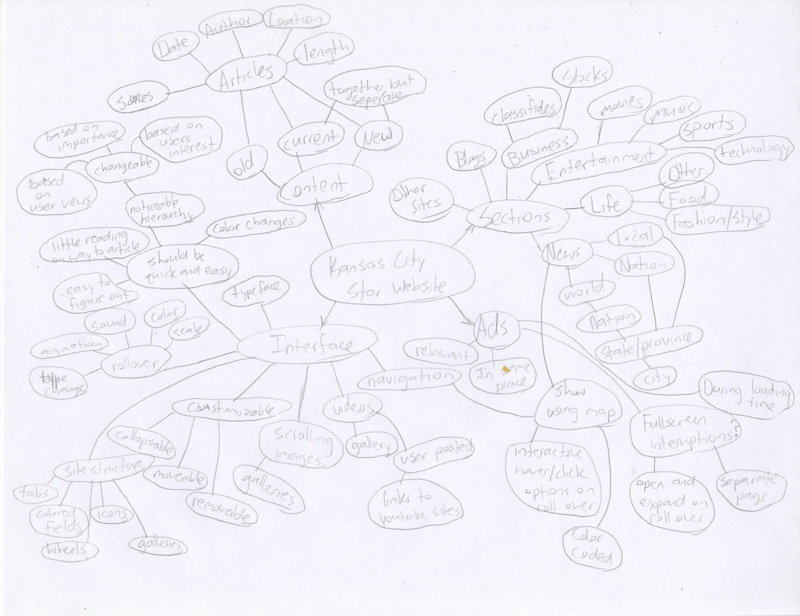
So my main concerns with the website are the navigation, organization, and hierarchy.

The navigation for the news site isn't bad by any means, it's just a bit ordinary. While I like it's simplicity, it's a bit boring, and could be better utilized in the pages structure rather than throwing it up at the top of the page.

The organization could be better as well. I hope that in my new sectioning of News, Life, Entertainment, and Business their subcategories can be major content limiters. Upon loading the website, the user is bombarded with information and columns of text that span down well beyond 4 times the computer screen height. Better sectioning could solve this issue. I would also like to include a section for the day's articles, the old articles, and one for the new breaking news articles that are added throughout the day. This way, there is an end to the content unless you want to browse through the added content. Color is also used, but it tends to get lost among the images and such. Rather than colored banners, colored fields might be more appropriate.

Finally, the hierarchy is a mess. It's true that an understanding of hierarchy has been applied to these articles, but here are so many different colors and sizes and images and ads that the hierarchy has strictly been limited to size. Having so many articles on one page is likely the issue, and a better organization of those articles will help the hierarchy to stand out once more. I also think that a past read or interest based system can help customize hierarchy to each user. One article might be important to one person, but not to another. So I would like to use the listed order of articles to influence hierarchy, as well as creating a website awareness to what the user has read in the past to better tailor the hi-lighted articles for the reader.

Friday, January 28, 2011

Information Architecture: Kansas City Star

So for the first project in our Information Architecture class, we've been assigned sections of different newspapers. By nature the websites for these pages are cluttered masses of content and a little user unfriendly, so we are each tasked with redesigning their website, better tailoring it for the user's needs.

I have been assigned with the Kansas City Star's New's section. This pertains mainly to world news and business, rather than sports, music, movies or anything lifestyle related. So we started with a look at the physical layout of their printed papers, and compared them to their online website's structure and layout. I'll upload the images of the paper layouts at a later time, here are the web site layouts. The Pages.

My reactions as a newcomer to the Kansas City Star's webpage was all in all a good one. While there was a massive amount of content to go through, the designers gave each section on the homepage the option to collapse and hide its information or to be moved around in relation to each-other. This layout saves when you come back to the website later, so you are able to customize the page to fit your needs as a reader.

The ads are still present, and I believe this is inevitable. However, there aren't near as many as the printed newspaper, and they are considerably smaller. Rather than being dispersed throughout the articles and layout, they are placed to the right side in their own column. As far as I could tell, the ad's themselves didn't relate to the sections they were under in terms of content. 


Thursday, January 27, 2011

Type 4: Type Symposium Project

So for Type 4, we are going to put on a Typographic Symposium for a crowd of high-school students and the KCAI freshman. The symposium will be educational and entertaining, showcasing a different type experiment from each student in our Junior class at the design department. To start the creative and planning juices flowing, we've started with a series of concept webs, which we have combined into a giant one. Pulling all the ideas together.

New Semester New Classes

So the new semester has started. I have added another class to my schedule this semester, so things are going to be a bit tighter this semester. Hopefully I'll hit the ground running and adapt. In the meantime, we've already started on a new round of projects. I'll get those as I go. The new classes include Typography 4, Information Architecture, and User Experience.

Followers