These are some in class questions I am considering exploring in my upcoming Modular Fragmentation experiments for the Atypeical symposium.
Can a typeface function when it's spread across multiple planes?
Do said planes affect visibility of layers in the back?
How does color affect transparent shapes?
How can overlapping fields of transparent color produce a typeface when combined?
How can the shapes of a modular typeface shift and interact with one another?
How does the viewing angle affect legibility of typography existing on multiple planes?
Can negative space be used as a modular element?
How does scale of modular shapes affect the typeface?
How can the audience participate in the creation of a modular typeface?
How can the audience alter or change an existing modular typeface?
The 5th question in bold, is the question I'm going to pursue for now, attempting to find answers and exploration will be the focus for my experimentation for the next week or so. I will post some examples of my experimentations as I go.
Experimental Typography. Whatever that means.
This reading was quite an insight in the term "experimentation". I've never really stopped to consider just how much design relies on that word, and to just what extent experimentation actually occurs in the design process. This article discussed experimentation's scientific roots as a term, and related that to the percieved definitions we designers attach to it. From the designers that were surveyed, it seems most consider experimentation to represent new or groundbreaking outcomes that haven't been seen or done before. Of course part of me wants to admit that just about everything has been done, but with new technologies making their debut each year, designers have an every increasing platform for our own "experiments". Experimental typography in particular seems a science in itself. Linguistics and the symbols that make a language possible are a system, and for the typography that works with that system to stray and take on new forms and meaning is an experimentation, scientific or not.
The act of process is the origin for experimentation. As a designer, I love process. It is just important to me as the ending product, and there are infinite possibilities in reaching a final design solution. Typography is no different. It can be created in many ways, read in many ways, not read at all in many ways. The article briefly covers a few opinions that don't accept projects that have been done in the past to be experimental. I disagree with them. While it's true that a completely new process is experimental, each person has their own design experience to flesh out. What one person has done thousands of times is something completely new to another, and that process can always be done in a different way.
The Typographic Experiment, From Futurism to Fuse
This reading was a bit hard to sift through, but has some great discussion on the experiments occuring in typography today and in the past. Typography is more than just letterforms. The space, materials, the language itself, and many other elements all influence the readers experience. When a designer steps into that relationship and alters the text, it creates something unique that stands out from the typical typographic rectangle on a white page. Language and communication is broad, and a letterform not only has form, but a sound and other meanings society pins onto them. A group of letterforms interact with eachother, holding encoded messages we have learned to understand. If our symposium is going to hold a wide range of type experiments, we would be wise as designers to look past the simple fact that letters are shapes, and dig deep into just what a letter is and how it works when altered.
What did you think of these readings?
I thought both of these readings related to our current point in the symposium process, and were a great introduction to the possibilities of working with letterforms and the written language. I'll certainly keep them as a reference for later typographic work.
Does their definition of "experimental" match what you previously thought of the term?
Yes and no. While I do agree that experimentation is primarily the process of design, I don't believe it has to be new. It boils down to the experience and learning something you haven't done yourself. Learning first hand is always better than simply reading about someone else's work on the subject, and there's always the possibilities of new variables when you experiment yourself.
Is it really useful to experiment if it doesn't have real application?
Definitely. Experimentation above all is a learning process. The experience of doing something new might be a bit intimidating, but we learn from doing more than seeing. While there is a lot to gain from analyzing the finished product, how we arrive at those finished products is the real story.
As we proceed forward in our subcultural awareness campaigns, we've been asked to read through 4 different readings and relate them to our current project. I'll start with the reading in Megg's Type and Image, under the "Audience" section.
In this section, Megg discusses the necessity and problems that come with using pictographs, ideograms, and petroglyphs. In the process of using these each viewer, or the audience, has a different perception of the visual language being used. This perception is formed by many things, including their culture, age, gender, location, and past experiences. As a dominantly visual art, graphic design faces this problem at every turn, and is very much intwined with it. Our current project is specifically designed for a particular subculture; in my case, it's the bike commuter subculture. By using our past research guides and techniques, we've discovered a wide range of visual and verbal language and signifiers that they identify with. These function in a similar if not identical way to Megg's mentioned pictographs, ideograms, and petroglyphs. However, since our audience is not near as broad and their perceptions, though still remaining different, will be within a similar mindset. The bike commuting community all share a graphic landscape and way of communicating and acting in society and it's my job to design for that community to illeviate any communication noise that would step between them and the design's message for my campaign. By using the audiences visual and verbal language, a designer can get his or her message across much more effectively.
The next reading wasGraphic design in a Multicultural World by Katherine McCoy from How Magazine. Katherine McCoy begins her discussion by bringing the idea of mass design to light. With computers doing much of the older design work and methods, universal design is slowly dying out. In today's society, mass communication and technologies have begun to globalize information and mix culture. Communities have as a result, split into smaller groups and subcultures. This not only pertains to the civilian, but corporations as well, as they shrink and better tailor there business strategies to a particular audience, location, or culture. These subcultures form a sense of pride and create a visual landscape around them. As mentioned in my response to Megg's section, the visual and verbal language these people adopt is an essential element in tailoring any design to a particular subculture. This creates design from the inside, and the audience is much more likely to listen to someone that understands them as a subculture. The bike commuter subculture for example would rather be exposed to design from other bike commuters or a company that has tailored their product to their needs and style. A universal corporation or group's design on the other hand would likely be disregarded altogether since they are outsiders, and their design won't utilize the right channels to target that subculture. This is where design research comes in. Today's designers absolutely must be able to employ a wide range of research techniques so that we understand the receiving end of our design on a much more balanced level to the sender's role. Particularly in corporate design when we work for a particular client, we often focus too much on the sender's role in the designs outcome when it should be the receiver or audience that should always come first. The location, the visual and verbal language, the channels, the style, the rhetorical tropes in play, and any symbolism and imagery must all be considered when addressing a particular audience. Otherwise, the design isn't speaking or coming across well with the user.
Next was an article named Local Lingo by Alice Twemlow from AIGA Voice. Design research is the overall subject of this article. It covers ground I haven't been exposed to however, in that it discusses the need for a designer to immerse themselves in the location. With global travel available and widely used, graphic designers are now employed by companies all over the world, many of them overseas at other branches of their design company or working in the field of a design target location. Design research can only get you so far over the computer. A designer's research techniques should not be restricted to only books and online material. There has to be a connection and experience on a personal level, and that means that for the best design solution for a particular audience or subculture, the designer needs to visit the target location and experience it for themselves. Alice Twemlow mentions that "the climate, materials and physical constraints of a particular region" are all necessary to understanding how the targeted subculture works, acts, thinks, and communicates. By following the subculture and participating in their activities we can better construct our prototypes and discover areas that need to be worked on. Through task analysis, we can also find problem areas within that subculture that could be solved through tailored design solutions.
The final article was Pop Artist by Linda Tischler from Fast Company. This article covered David Butler's new design systems for the Coke corporation. Linda Tischler reviewed the companies decision for a new system of machines to distribute coke worldwide, and the use of a modular design system from Butler. It was an interesting insight into designing for a company with so much change, yet so little. While Coke's product remains the same, their logo has undergone minor refinements throughout the years, and their product design has gone through major design shifts. Butler began by looking through thousands of past coke designs so as to understand where the designs started. In this way Butler placed himself inside the companies design roots so he could understand how the company started and gauge what has already been done in the company's past. Butler has employed a massive system of systems. The new coke machines that will soon be used in resteraunts and other locations around the globe will use a new interface, allowing the user to interact with a screen. Language, product, and occasion have all become selection options on these new dispensors, and the machine prints a wide variety of designs from around the world (over 8,400 so far and climbing). Coke also has the ability to upload new designs to the machines very quickly and can use these new designs to better appeal to customers on a local and cultural level. My interest however comes from the machines ability to record user information. It keeps records of product choice and popularity, times of purchase, and much more. This helps Coke to better observe buyer trends and patterns and can better tailor their product's application. In a way, their machines are doing a basic form of design research constantly throughout the day. Butler has made a great use of new technologies in todays digital landscape, a bold move that graphic design has supported from the beginning. I hope that Butler's machines go over well, and will strive to adapt my future design to new platforms as well.
Here are a few things I ran across on spring break. Some of them show trends that have been reoccurant in the typographic field, but most are things I found interesting.
So the books have been completed for our subcultures. From here we have moved into eachother's subcultures if we desire, or we can stick with our own and we are making public service campaigns to appeal to members in these subcultures. I decided to move into the bike commuter subculture, and I'm working on a campaign covering various aspects of bike commuter safety.
This is my first round of designed artifacts for the project. I am using 2 channels. This channel is a tag that could be placed around a bike frame or bike rack, and would be passed out by someone, targetting bike parking sites. These tags use a statistic on the back relating to the safety subject that is reflected, no pun intended, in the pattern on the flip side.
So when coming out to see their bike, they find a tag, and are confronted with a pattern or statistic first. This one reads: "Using bike reflectors at night decreases your chances of an accident by 60%. Over 60 million people use them worldwide. See the Pattern?"The tagline at the end then ask them to realize that if they are not part of the "pattern" or statistic, that they clearly should be. This also makes a design pun on the flip side's object pattern.
This pattern is a simple and refers to an object of safety. In this tag's case, it is the reflector.
For the next channel, I have designed spoke cards. Spoke cards are a widely used graphic element among the bike commuter subculture. Essentially these are card sized pieces or design which could be anything from band advertising, to pattern, or advertising they like, anything really. So these cards are handed out in a similar fashion as the tags at bike parking sites, and are tucked into the spokes of the wheel. In this way, it appears that the design is coming from inside the subculture, and is more likely to be accepted positively.
The first tag is a folding functional reflector option. I would like to see this used for the other safety options as well. I've also considered the idea of designing only for the Weight Weenies of the bike commuter subculture. A Weight Weenie is a bicyclist that will sacrifice anything and everything to make their bike as light as possible. This includes brakes, lights, reflectors, helmets, and the purchase of expensive ultralight materials if only for an ounces difference.
So after last classes critique, I got the most positive feedback from my analogue sketches that were superimposed over the photos of each camera. In this way, my rendering style reflects the analogue properties of the camera in my collection. The chosen layout however, comes from the digital icon layout. I had to adapt it to a full format since we are on a tight time frame to crank out these websites, and creating scrolling content and capabilities in flash for a website is pretty difficult. I've also turned the TLR cameras right side up, so that they are oriented as they actually would be when used. The first two sorting worked pretty well with the TLR's in the layout, however, the third has some issues since by camera type, three TLR's occur in a row, which can't be done vertically in a single column. So that still needs to be addressed. For now I simply pushed a fourth camera on each vertical column to make space for the first TLR in another column.
In each of the macro layouts, I have began using a negative image that focuses on details of that particular camera. The negative reflects the analogue film each camera uses, and helps to provide contrast for the type to be legible. For now, the info graphic on the right hand side is all I have in the layouts, so the info graphics will be shown some love next. The printers were also not working last night, so I couldn't print the cameras out to draw over them, so for now the other cameras are strictly photography. But refer to the Minolta Autocord, Kodak Instimatic, and Nikon TG-20 for the sketchy quality the others will have later. Each camera, when in the macro view, will have a smaller set of thumbnails below them, which when clicked will change the larger main photo. These photos will be without the sketchy rendering properties, so that the full camera and details are unobstructed.
So in an attempt to catch up for the last class missed, I've began rendering my collection in various ways. Ideally, I would like the website to be influenced by this rendering style as well.
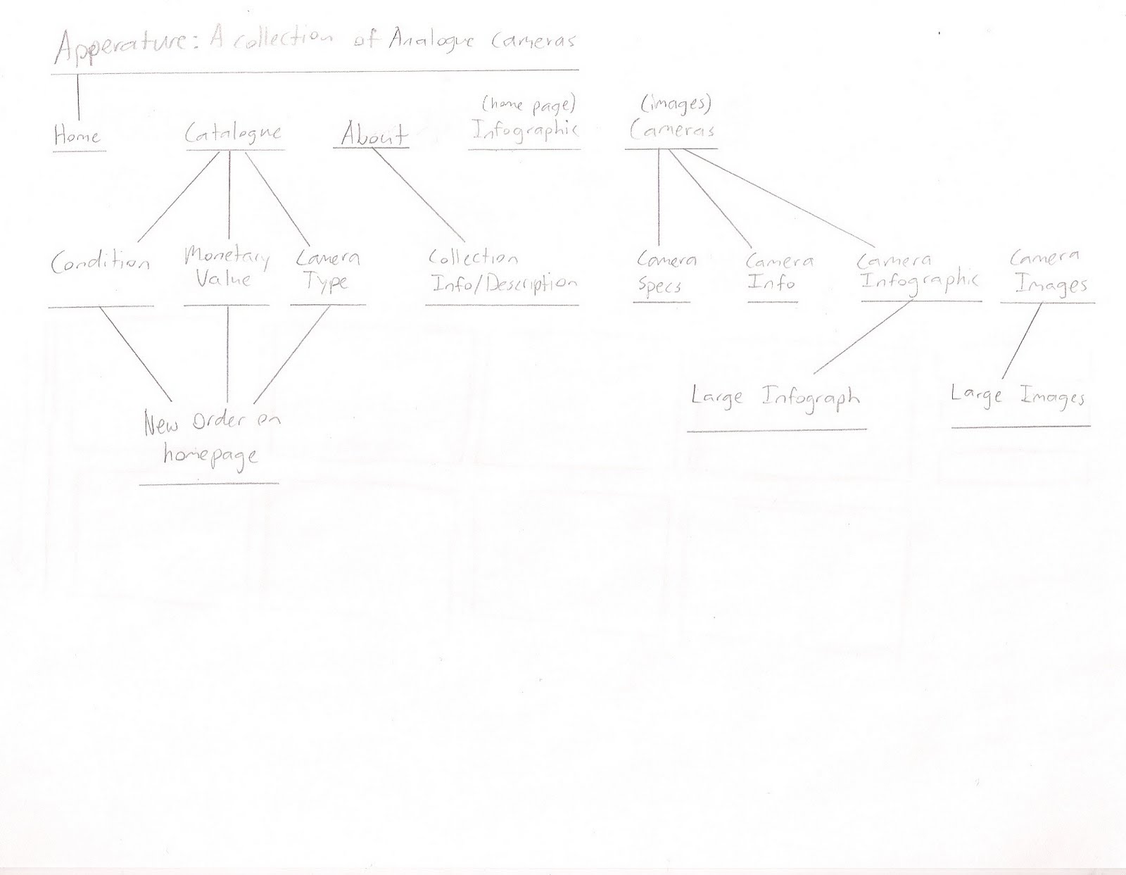
My layout was the larger image layout from the last deliverable. There was a better variety of formats I could use, and it didn't contain any imagery itself like the other two did. In this way it can function as a template, rather than a style. I did alter it a bit however, as well as the sitemap.
The sitemap is still rather basic. I need put some thought into what would be available on a collection website. At the moment, I'm at a loss, other than what's shown.
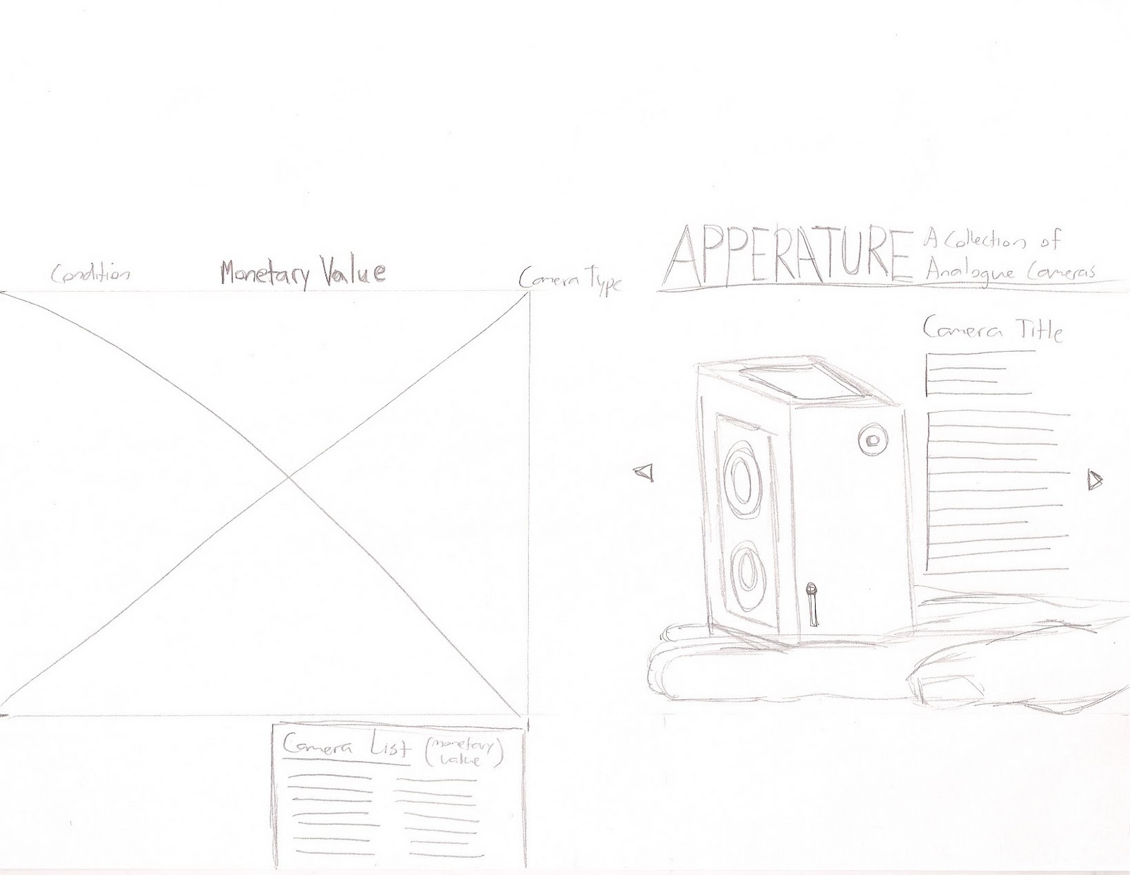
My first rendering method uses a vector icon-esk style, super simplifying the cameras, other than a few main features. Color can be easily applied to these, and they add a nice modern flair to an otherwise antique collection.
The Macro View
The Micro View
In the Macro view of this layout, I made use of a scrolling verticle section housing each of the cameras in the collection. They are colored in this one to better separate them, and to add some contrast to the website, which is admittedly plain at the moment. I have a lot of work ahead of me. In this version, when you hover over a camera on the left side, 4 images of the camera show on the right, highlighting defining features of the camera.
In the Micro View, after clicking a camera on the left, we are taken to that cameras own page. Here we see an infographic on the right (or would if there was one there), and get some detailed information on the camera itself. The initial image would be the icon of the camera, but the arrows to the sides of it will flip through real photos of the camera for additional visual characteristics.
For the second rendering method, I sketched the cameras, then placed them over straight on photographs of the camera. The layout of this meathod uses a few hand drawn elements to tie in with the sketchy qualities of the rendering.
The Micro View
The Macro View
I like the idea of drawing, and it has an interesting mix of old and rough, and modern and clean. Adding the photographs behind them also add a bit of shading to an otherwise black and white plain sketch. The Macro uses the same functions as the last method, but with only 2 images that are slightly larger. The Micro page has a series of photographs underneath the main camera sketch, so they can view the camera without the white filter over it.
For the final rendering method, I chose photography. For this layout, I chose to keep the hope page clean of any pop up images on the right, so as to keep the background image in view. The transparent backgrounds help to keep things relatively legible, and ads a bit of depth to a flat webpage.
The Micro View
The Macro View
This method came out as my favorite, and seemed to have more drama than the other layouts. In particular, I enjoy that the background can show large shots of small details on these cameras. While I haven't employed the idea in this method yet, i would also like the image in each macro page for each camera to contain shots of the camera you are on. This way, the image would relate more to the content of the page.
Today, people are raised and schooled to become specialized in one particular skill or practice. In the past, the family and community taught people a wide range of basic skills, so that they could be more self reliant and thrifty. In today’s society, without that basic knowledge of doing it yourself projects, people call in professionals to do the job for them, wasting money on charges and fees and time. 2. What are its causes?
The lack of basic do it yourself knowledge. Parents and schools aren’t teaching simple things to children anymore such as fixing a tear in your clothing or changing your own oil.
3. What are detrimental effects to individuals? to greater society?
These children grown up reliant on other people and lose that satisfaction of solving these problems on their own. A vast amount of money is wasted when compared to doing the job yourself, because you are paying for that persons time and increased prices on objects used by that professional that could otherwise be far cheaper bought from your local stores. 4. What are preventative measures?
There are 2 solutions to this problem. The first is to teach your kids basic skills as they grow up. I personally wish there was more parent to child teaching in my childhood. The second is for the DIY community to step in offer their services to the community. The DIY community could do the job for far less, if payed at all, and could teach the family or individual how to do this themselves should the problem arise again. The DIY community could even accept favors or things from people rather than money, even swapping knowledge or other DIY services to each other and share knowledge in the process. 5. How does this issue relate to your sub-culture?
The DIY subculture is a culture that loves knowledge and tries to specialize in a multitude of skills, rather than going to college for just one. The DIY community is the perfect group to spread knowledge and skills, and love doing it. The sharing of tools is also important between the DIY communities and average citizens. 6. What organizations have a vested interest in this issue?
DIY groups have formed in the past, including Brokelan in Brooklyn and various groups such as Motiv in Kansas city that this exact service. They teach their skills to those willing to learn, and will repair things for people in need for little to no cost when compared to a professional’s price. 7. What organizations have a vested interest in your sub-culture?
Brokelyn, Motiv, The salvation army, Habitats for Humanity, Seattle DIY 8. What public service campaigns have previously addressed this issue?
The Early Childhood Development campaign vaguely gets at teaching your children as they grow, but targets children at very young ages, whereas most DIY skill would be better taught to a teenager.
Besides this, I could find no other campaigns.
Bike Commuter Safety
1.Why is this issue pertinent and timely?
Many civilians are turning to bike commuting to save on gas costs and to lessen their carbon footprint. However, in many large cities these commuters are without bike lanes and are at risk to other vehicular traffic. 2. What are its causes?
People new to the bike commuting culture, in need of proper bike safety education on and off the road. Drivers around the city unaware of cyclists around them on the roads. 3. What are detrimental effects to individuals? to greater society?
Accidents are caused by both unaware drivers and cyclists/ commuters. Some people that might be interested in the world of bike commuting might decide against it simply because of the safety issues. Because of this, more people are driving and continuing to waste money on gas and damage our planets environment. 4. What are preventative measures?
You could raise awareness with a series of posters or ads showing the tools available to the commuter that keep them visible at all times. Bike accessories such as lights, helmets, and reflectors, as well as knowing proper cycling etiquette and hand signals for the road can all lend to a bike commuter’s safety. Another is to promote services to group together bike commuters in the same area. By grouping commuters together, they become more noticeable and safer. They could also share bike knowledge to newcomers and create a more immersive commuter experience and help people meet new people. The final idea is to target the drivers. Many campaigns have already covered this issue however, so it might not be as impactful. 5. How does this issue relate to your sub-culture?
Anyone will put their own health before just about everything. The bike commuter in particular is usually concerned about their health and use biking as a means of exercise. The switch from driving a vehicle to being exposed must be met with many safety precautions. 6. What organizations have a vested interest in this issue?
The NBSN, or National Bike Safety Network,Bicycle Federation of America 7. What organizations have a vested interest in your sub-culture?
The NBSN, or National Bike Safety Network,Bicycle Federation of America, Association of Commuter Transportation, ACT, Kansas City Bike Club 8. What public service campaigns have previously addressed this issue?
The People for Bikes Campaign, The Maimi’s Public Bicycle Safety Ad Campaign, The LOOK campaign, The See and Be Seen safety campaign, Tacoma’s new Bicycle safety ad campaign, the Ride Safe Campaign
Bike Theft
1. Why is this issue pertinent and timely?
In today’s harsh economy the theft of bicycles has become increasingly common. The metal cutters used today continue to become stronger and more effective. Many bike commuters use bikes as a way to save money, or as a form of the only transportation they can afford. To some, a bike theft can cause many problems that aren’t just financially centered. 2. What are its causes?
Metal cutter quality and capability is increasing, and can cut through the vast majority of chain locks sold to the bicycling community. People are unaware that the cheapest u-lock will be more effective than the most expensive chain lock. Being aware of the area your bike is parked in, as well as what it is locked to is also very important. 3. What are detrimental effects to individuals? To greater society?
For those that can easily afford a bike and only use it for entertainment, they are likely only inconvenienced briefly and have to deal with their attatchment to the bike. For some however, the bike is their only financially possible option for commuting from place to place. If their bike is stolen, it might not only take a major financial toll, but it can keep them from going to work, or missing school. On that level, they also develop a deeply personal attachment with the bike, and losing something you are so reliant on can hurt on an emotional level as well. 4. What are preventative measures?
To prevent bike theft, you can us a U-lock. Most U-lock companies will insure your bike if it was stolen when properly locked. Raising the awareness of places not to lock your bike is also important. Sign’s can be removed off poles and a thief can slide a bike off the top if given the time at night when no one is around. The end of bike racks can also be unbolted and the bike can be slid off. Practicing locking your bike excessively is also a great practice to promote. It only takes a minute to pick up a bike, throw it in the back of a truck and drive off. 5. How does this issue relate to your sub-culture?
A bike commuter would have a hard time commuting without a bike. 6. What organizations have a vested interest in this issue?
The NBSN, or National Bike Safety Network,Bicycle Federation of America 7. What organizations have a vested interest in your sub-culture?
The NBSN, or National Bike Safety Network,Bicycle Federation of America, Association of Commuter Transportation, ACT, Kansas City Bike Club 8. What public service campaigns have previously addressed this issue?