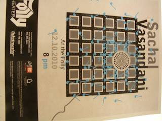
To give you a bit of an idea to what we had to work with, here is a link to his music. Take a bit and enjoy.
http://www.myspace.com/sachalvasandani
So to start, we created a mood board. This essentially was a collection of imagery, colors, typography, just about anything to hint at the mood, style, pretty much what Sachal and his music "are".
Colors that seemed to fit reflected his calm, modern, and experimental style. The typography followed suit in the forms of modern san serifs. Sachal has always been a city dweller, and has a very sophisticated air about him, so modern architecture also found its way in. The placement of the imagery could have used a bit of work looking back on it. Probably something more organic and free.
After the mood board, Vi and I split ways. The project was essentially a competition. The Folly will only choose one of the posters from our entire class to advertise at the Folly, so we all set off to make our own posters. From here, we created matrixes that taught us the use of rhetorical tropes such as Hyperbole, Pun, Metaphor, Synecdoche, Parody, Irony, and much more.
Using these tropes, we sketched little ideas for design motions in our posters. Here were a few of mine:
After a very specific and difficult critique of our matrixes, we set off to make 15 sketches of 3 of the matrix ideas in poster format.


The next critique for these sketches narrowed my focus down to my hyperbole idea. This was the last image with the microphone hidden in the landscape. The city really reflected his big voice in a big city, while remaining true to his modern/ indie style of Jazz. I also loved just how geometric a common building facade was. So with idea in hand, we started making digital iterations of the poster. The media used to make the poster was left up to use. You could use water color, photography, pencil, the computer, whatever. I did a combination of photography and illustrator.


The illustrator posters ended up looking far to flat and didn't really speak much to Sachal's style and warmth. The photographic one however, with the lit up city turned out interesting. I had to create a small city out of paper and lit it from underneath. The microphone however, was not coming across as a microphone at all and there would have to be some major work done in terms of craft and typography. Further iteration was needed, so I began making more buildings and reshooting them with a better camera. I also checked out a real microphone and shot it under dark light to place it in the city separately.


In the first 3, I cut out the text and lit it to get the shadows. I wanted to use lighting to tie the text in with the lit city, but the text came out looking quite scary actually, and difficult to read. So I returned to vector and illustrator in the 4th poster, and continued with that same idea of putting text on a plane. It was certainly better, but still needed work, and the amount of buildings and such were far to many.
The color of the light was also a little stark, so I turned up the saturation a bit and added some warmth to the poster. I also separated the type in a name group and information group, so that the viewers eye were travel across the poster. I photographed light and shadow and brought it into the type so it wasn't such a flat plane of color and would mimic the darkness at the base of the buildings.

I ended up choosing the layout of the 1st poster, but there needed to be more space and some more treatment done to the type's perspective. The purple also wasn't speaking much to the mood boards colors, and didn't really represent Sachal all to well. So After going through greens (too alien), orange and reds (to monochromatic), I finally settled on blue, which I love. Below is the final poster.
The blue really pops, and gives a feeling of sky with it's texture, which really speaks to me. The dark city representing Jazz clubs and the Jazz scene, while the sky represents Sachal Vasandani's airy and open music.
The final step was to make our posters black and white, and place them into new formats to fit in magazines and papers as an advertisement.
So the final critique is today, combined with a public showing of all of our posters. Many people including the faculty and a representative from the Folly will come and based on what they see, choose the poster they think works best. I'll let you all know if mine makes the cut. Thanks for reading!


No comments:
Post a Comment