So last class period, we began by organizing out collections on a series of index cards. The placement of these index cards in relation to each other revealed different cataloguing methods and helped us sort information of each item into categories for our website info-graphics.
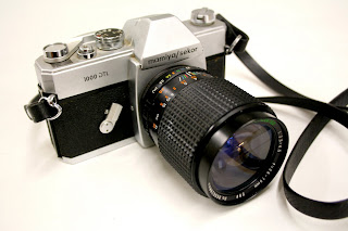
Here are a few of the cameras in my collection. I will be receiving more shortly and will post those photos of the expanded collection at a later date.
Here are my initial sketches and brain storming lists.
For my main 3 cataloguing methods I am going to sort the cameras by their:
1. Camera Type
2. Monetary Value
3. Condition
My info-graphics so far include:
1. Number of steps to take a photograph
2. Camera Viewfinders
3. Monetary Value: Ebay Vs. Amazon
4. Film Formats
5. Bellows Camera Parts
6. Image Size
7. Location of Manufacture
8. Size and Weight
9. Time of Manufacture
Monday, February 28, 2011
Wednesday, February 23, 2011
User Experience: Pertinent Community Education Articles
So here are the four articles I found in our class time. I'm interested to see where these articles fit into our design research section for the User Experience course. It appears that across the board, most issues in community education lie in the federal funding and budget or the school district. The two most interesting articles were the second and final articles. Studying abroad is a great addition to any college curriculum, and the fact that it is racially affected is an interesting subject. The final article covered the ever-climbing costs of campus maintenance, particularly on those with old historic buildings. The campus learning environment needs to be safe and clean, but money problems are putting stress on the students, the teachers, and above all, some great historic architecture.
Kansas House votes to repeal tuition break for children of illegal immigrants
Educators seek out more minorities to study abroad
KC district beefs up security at troubled Southwest school
Kansas delays pension payments and school aid
Funds for repairs lacking at Kansas and Missouri universities
Kansas House votes to repeal tuition break for children of illegal immigrants
Educators seek out more minorities to study abroad
KC district beefs up security at troubled Southwest school
Kansas delays pension payments and school aid
Funds for repairs lacking at Kansas and Missouri universities
Labels:
Articles,
Education,
In Class Work,
Research,
User Experience
Wednesday, February 9, 2011
Type 4: c/id Reading
So after reading through a few of these museum and space exhibitions for design identity possibilities for our type symposium, a few thoughts come to mind.
The Frieze Art fair's identity worked much like a typographic template. The photography was interchangeable throughout their formats and was the star of the layout, with the type functioning as a secondary aesthetic element. Now don't get me wrong, I love their photographs, but in our type symposium, type is the star. So I believe that some merging of our type with this possibility of photography could create some dramatic and alluring imagery for our symposium's identity.
For the MoMaQNS, I thought their identity was a little busy, but I thought their concept of showing motion was an interesting design choice. Their system, much like Frieze's, is tightly bonded with their navigation at the event/ venue, and I thought Base Designs designing for the nearby subway stations was a brilliant move. Now assuming we had a budget for some massive signage, that might be something we could reach, but dealing with our realistic budget, it's better to other things from this. 1. Our design could relate in some way to the area it's being distributed or shown in and 2. Movement of the viewer in relation to the object can be used as a strength. They don't have to be standing still to view the piece.
The Mori Art Museum of Tokyo, Japan had some incredible imagery for their venue as well. It functions in the same way the Frieze's identity does. Their Type is a little more involved and up front however, rather than residing in the photo's quiet space. Our typography should be bold, and utilizing some dramatic imagery will help grab the freshman and high school audience we are seeking. Their swag is also well designed, and sticks within a limited color palette, which helps to create unity in their design, even though it changes between swag articles.
The Stedelijk Museum CS in Amsterdam was my favorite of the sections in our reading. Experimental Jetset did some awesome work in using a color scheme and type arrangements to create a modern and poppy feeling that would surely reel in many of the high school crowd. Their identity is an adaptable system that is modular and interchangeable by using the sleeves, and I think this idea of modularity could be a nice subject for our type symposium. I think that challenging the viewers ability to read the text is a great way to grab their attention and really get them asking questions on typography's potential to be more than a font or a page of information. We need to show them that typography is visual language in itself, and can be used in many different and interesting ways. By using a common color scheme, their designs, although differing significantly in terms of arrangement of type, are all unified. They are simple with typography as the main interest, and rely on composition to grab the viewers attention.
I didn't really enjoy the Walker's identity as much as the others. While their concept of stringing together a system of words in a linear order is awesome, their graphic execution is a bit boring to me, and reminds me of caution tape.
All in all, these were great reads, and I hope our symposium's identity turns out just as unique and successful.
Labels:
Reading Response,
symposium,
Type4,
Typography
Friday, February 4, 2011
User Experience: Progress Documentation
So we've completed our interviews with the DIY subculture, and we've sent and received our culture probe. Overall the experience was amazing. Our first interview was a bit older and employs his DIY skills in the career and maintenance field. The other pair we interviewed were younger, and pursued the DIY culture in a more personal and creative way.
Here's the recordings of our interviews for your listening pleasure:
DIY Interviews by blyonkcai
And here are a few images of the culture probe before we sent it out:
The probe was quickly designed, but turned out pretty well I think. The main capsule is a section of pvc pipe with 2 unscrew-able end caps to access it's insides. The DIYers were encouraged to decorate or use the capsule in any way they wished. Inside we included 1 disposable camera, 1 thumb drive, 1 set of questions, 1 map, and 1 carpenters pencil (unsharpened). Each item had a tag with instructions on the items use.
Wednesday, February 2, 2011
User Experience: Secondary DIY Research
DIY Research-
• Due to technologies today such as the internet and it’s integration into many devices, including our mobile phones, the world is slowly become homogenous. The same information is open to anyone and everyone. With such information, anyone can learn new skills and begin their entry to the DIY subculture, doing projects and repairs themselves rather than calling in professionals.
• The sharing of information and the beginning of the DIY culture likely began with the introduction of written texts and ultimately with the mass production of books in the industrial revolution.
• Guilds of the past also helped in teaching new skills many of those willing to learn.
• The Arts and Crafts movement has been a key element in DIY history. With the introduction of the industrial revolution, a new wave of machine workers replaced hard working craftsman, and the new mass-produced objects had nowhere near the quality of those produced by the human hand.
• The Free Festival Movement also greatly added to DIY culture. In the 70’s, both North America and the UK began green practices, recycling materials and using them over and over again to stand against materialism and capitalism. These goods were cheaper and thrift stores and resale shops became increasingly popular.
• Today, DIY culture is a way of life. With increasing prices and economic hardships, people are adopting green practices, repairing old things instead of buying new things. Their motivations are to save money, create less waste, oppose consumerism, and to create a personal identity for themselves.
• DIY repairs, particularly in fashion and furnishings tend to carry characteristics of their creator, and become a form of expression. Mended objects carry a different aesthetic when compared to new store-bought things, and tend to have more personality to them.
• Most DIYers today have a neutral political stance, only doing their own projects for monetary reasons or simply because they enjoy their old things.
• DIY culture exists in just about everyone, though in different intensities. DIY can be found in career based work and in those working from home or without a desire for profit.
• Today’s digital technologies have also rekindled a love for hand made goods and the hand made processes. It’s this reason people still hand develop film or knit their own scarves. The experience of creating the thing outweighs the material object that comes out of that effort.
• Websites play a crucial role in today’s DIY culture. Social networks have been created to sell hand crafted goods (such as Etsy), and there are many sites with how to demonstration videos for many projects.
• Books have stepped up as well with series like the “For Dummies” books and other how to projects.
• While it doesn’t apply to all DIYers, there is also a love of the story or life of an object. When someone goes to an antique store or thrift store and buy an item to use in a project, or simply to breath new life into it, they love to consider what happened to it in the past and who owned it. Old and recycled things tend to gather character in this way.
• Other sources of media are used as well. There are a multitude of television channels, each with their own website, that give hundreds and hundreds of projects for beginners and professional DIYer’s alike.
• There is a group of DIY activists in existence today however, including Betsy Greer who coined the term Craftivism in 2003. This group of DIYers stands out politically against consumerism and the lack of personality and quality of machine made goods.
• DIY is about being practical and affordable. It also is about being able to be commercial while still being art.
• DIY creates togetherness, helping bring the family closer together. Creating something together requires them to interact with each other and cooperate bringing a sense of unity to the group.
• Doing DIY makes the projects more meaningful because you make it with your hands and take time to craft it just right.
Tuesday, February 1, 2011
Type 4: Symposium Titles and Definitions
So here are some definitions and titles to consider for the type symposium.
Definitions:
Titles:
Definitions:
Typography is applied in all media, and becomes overlooked. Today, design is taking typography to new places and generating it in all new ways. In this symposium type will be rediscovered through a series of experiments, activities, and processes.
Between the worlds of type and digital media, typography has been pushed beyond the baseline and the norm. In this KCAI design symposium, you will be introduced and interact with a wide range of typographic experiments and take part in open dialogue discussing the world of type and how it's made.
Titles:
Alternate: A New Typography
Blurred: Typography as you’ve never seen it
Oasis: New Typographic Applications
Double Take: A letterform symposium.
Odyssey: A typographic exploration.
Skeletal: The structure of a letter.
Ascender: New Typographic Processes
Under the Baseline: Experimental Typography
The New Font: Type Generation
Illegible, Legible: The Typeface Evolved
A Certain Character: Typography Beyond the Norm
Type Writer: Modern and Expressive Typography
100% Vitamin T: An Overdose of Typographic Expression
Two Faced: The Other Side of Typography
The New Font: Type Generation
Illegible, Legible: The Typeface Evolved
A Certain Character: Typography Beyond the Norm
Type Writer: Modern and Expressive Typography
100% Vitamin T: An Overdose of Typographic Expression
Two Faced: The Other Side of Typography
Labels:
definitions,
symposium,
titles,
Type4,
Typography
Subscribe to:
Posts (Atom)