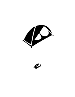
So for my icons, I've decided to keep with a simplified geometric style using a series of highlights to create a cohesive series. The title, "Ascending Everest" speaks for it's narrative, a treacherous climb to the summit of the worlds toughest mountain. Each icon has an enphasis on an upward diagonal movement, not only to have more similiarities across the board, but to really give that sense of climbing and getting to greater heights. I think it makes them more dynamic as well. All the icons also share a series of gaps, to keep them from feeling too solid or dense.
The series turned out well in their black and white forms, but there are a few icons I'd like to see improvements on. The crampons/ boot icon is nice, but still seems to be lacking something, and the flag looks somewhat like a pencil. Not sure how to solve the flags problems. I also think that the backpack could use something still. The backpack was by far the icon that needed the most iterations and work, and it still isn't up to par with my expectations.
The project has been a great one, and I look forward to translating them into color.
Here are the Icons individually:
Here they are as a set.
And here is a sample of the linear documentation/ process of creating the Ice Axe icon.
Thursday, February 25, 2010
Wednesday, February 24, 2010
VisCom2: Nearly There
Here are another round of the simple black icons. I think that as far as the number of icons/ objects in my narrative go, that I've hit the right amount. The other objects were weak, and didn't really need to be in there.
Another round of corrections after this and I should arrive at my final set. After that, I get to do 2 and 3 color versions, Woo!
Tuesday, February 23, 2010
Inspiration: Save the Pacific Northwest Tree Octopus
I was traveling through some blogs on touring and bicyclists since I'll be getting a new bike this week. (Old one got stolen.) And while going through, I caught this awesome poster design.
The tree octopus is obviously fake, but the poster turned out amazing all the same.
Type and Image: Conveying Wrath
Monday, February 22, 2010
Type and Image: Light Painting
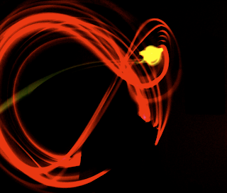
So after deliberation, I've decided to do light painting for the 7 deadly sins project. I haven't used this medium before, but I'll be attempting to communicate form and content through long exposures on camera, and colored light. (Probably glowsticks since they last up to 8 hours and come in a variety of colors. These will end up as almost performances, so it should turn out interesting.
Some examples of what I hope to achieve in terms of movement and color:
Sunday, February 21, 2010
Inspiration: Frederic Gmeiner
These were entries to Frederic Gmeiners extracts of local distance exhibition. The roots in modern architecture really appeal to me, and the way he's able to create both space and dimension in a flat work of art is amazing and beautiful. They also show their spaces in a creative and informative way that really changes the viewers perspective on the building.
Type and Image: 7 Deadly Sins Project
The next project for Type and image is a folding accordion book with a series of 7 images, 1 for each deadly sin, or holy virtue. I've decided to go with the sins. The image has to be taken photographically like last project, so I'm not certain yet as to what I'll do. So far I've decided to take images for simple versions of the sins most people do on a daily basis. I've also been thinking about physical collage from books and magazines.
Type2: Final Compost Poster
Well here it is, the end product for my Change One Thing poster contest entry.
All that's left now is to compress the files and upload them to my dns server for AIGA to download. Wish me luck, and good luck to you other designers entering!
VisCom2: Icon Direction
So after crit, it was decided I would go with my favorite and best direction of the 4 previously mentioned. The Geometric Highlights series. There there were a few icons I switched around from the other series to make it seem more cohesive. But here is the series as of now. More will be added, hopefully totaling up to 10 by the end of the designing process. Then it'll be a matter of making them into 2 and 3 color icons. Should be a blast, and I look forward to actually using these as dock icons on my computer when I finish with them.
Tuesday, February 16, 2010
VisCom2: Icon Project Update
So here are the iterations for the icons so far. There are many sketches I might upload later, but these were the ones that made it to critiques. The farther the chart is to the top, the newer it is. As you can see, the chart gets narrowed down in the newest chart, since the direction I want to take these icons in is slowly getting narrower. I'm particularly loving the Geometric Highlight series so far.
Monday, February 15, 2010
Type and Image: Finalization on George Eastman
So the composition is getting there, just needs a few minor changes. The quote banner placement is going to be pushed off to one side rather than sit square in the middle, and I'll attempt some hierarchy using perspective to get some of the images closer to the viewer. I'll also have to chose between one of the text placements below on the 120 film roll. The red pops really well and references Kodak colors, but at the same time it might be a bit to much.
Saturday, February 13, 2010
Wednesday, February 10, 2010
Image Making After-Crit
So here was my image after tiling it to be 24x36 inches in size.
After crit was over with, I've been left with work to do on lighting composition. I'll be printing the quote on actual 120 film in the final image so that the film markings will be there as well. I think the projection would be more noticeable as a projection if it was bent around a corner or around the objects. So on the final shoot I'll have to see about projection over different surfaces. And this gets me to my main change for the final image. I've grown a bit board with my simple black drop cloth after seeing my peers with cabinets and other interesting scenes that they constructed. So I think, to continue with my theme of light, that I'll try shooting on mirrors and with mirrors as my backgrounds. Should reflect the light and projections in interesting ways, and I'm sure it'll make for an interesting composition with the reflections of the objects.
Working with mirrors is apparently difficult in photography, but can yield interesting affects. I was thinking how much these ecletic collections of items look like those old "I Spy" pages from the books when I was a kid. Very much set up photography, and one in particular really helped trick the mind.
http://www.walterwick.com/ispy_funhouse_bts.htm
This was an interesting perspective into just how mirrors can be used to replicate objects and open space. Hopefully I use similar techniques in my final image.
Monday, February 8, 2010
Type and Image: Lenses and Projecting text.
I've decided to use projection to get my type into the photo's physical space. This will be acheived through a particular focal length between the lenses, a high powered light or lamp, and a transparency that the type will be printed on. After some brief testing under my desk in studio, I managed to get a little type projected onto my white wall. If all goes according to plan, the type when projected onto the black sheet/ back drop of my set up should show a bit more vividly. I'll have to do tests as to what size of printed text on the transparencies project the best for the size of my set. As mentioned in an earlier post, I've also tested shooting through the viewfinder of another camera, yielding some interesting results. They were blurry however, so hopefully shooting through my TLR, below, will provide a more crisp image. If not, I'll have to drop the idea.
This image shows the basic structure of a projecting rig.
Mine will have a transparency in place of the lcd panel. Holding everything by hand is very awkward and impractical, so I will have to make some rig to hold everything in place.
This image shows the basic structure of a projecting rig.
Mine will have a transparency in place of the lcd panel. Holding everything by hand is very awkward and impractical, so I will have to make some rig to hold everything in place.
Subscribe to:
Posts (Atom)